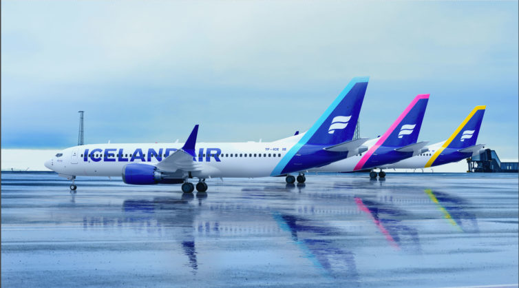
Icelandair’s livery refresh features larger titles with a revised font, and a variety of new colors on the tail – Image: Icelandair
In what Icelandair’s director of marketing Gàsli S. Brynjólfsson describes as “More of a refresh, not a total change,” the airline has begun rolling out an updated livery and associated marketing collateral.
Icelandair’s current branding was last updated in 2006. “We needed to strengthen our story and the emotional part of the brand,” Brynjólfsson said. “Icelandair culture has changed a lot, it’s much more relaxed than it was before.”
For perspective, he explained that the idea was to democratize the brand, as the current white, blue, and gold livery had been seen as a bit stuffy. “We took the gold out – it came up a few times in the talks with experts and focus groups that the gold-and-blue feels a bit royal – Icelandair is not a royal airline – Iceland is very democratic with small power differences,” he said.
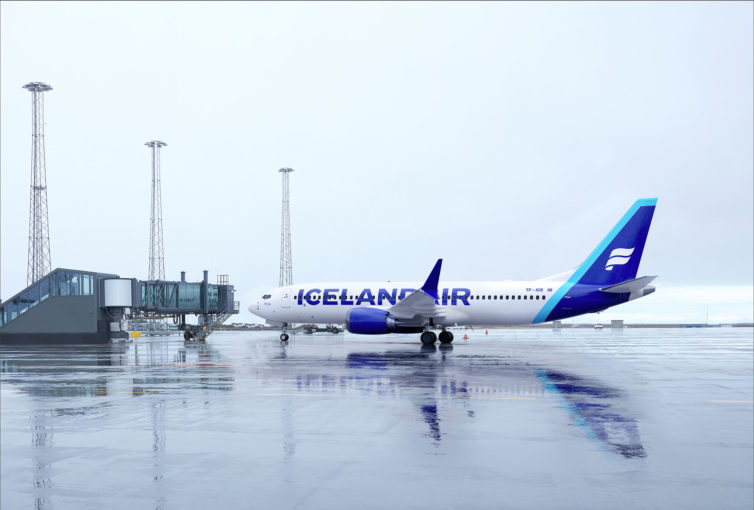
Icelandair’s now-former livery seen on its very first 737 MAX-8, TF-ICE, which was also the first in the fleet to receive the update
“We are so much like a normal Icelandic company – the power distance between people is very little – we’re a company of equals, so that’s something that needs to be represented in the brand,” he explained.
For those who are fans of the airline’s iconic special liveries like Hekla Aurora and Vatnajökull (the glacier livery), he was reassuring. “We’re definitely going to continue to have special liveries.” But don’t expect to see the new livery on the airline’s substantial 757 fleet.
“I doubt that we will do the refresh on the 757s – we’re doing just the MAX to begin with. The fate of time for those planes (the older 757s), combined with the cost of changing those planes, would not be reasonable.” He did say the airline’s two 767s would likely receive the makeover at some point.
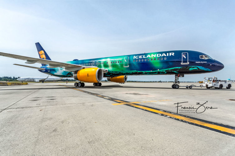
Icelandair’s special liveries, such as Hekla Aurora, will continue to grace the skies despite the overall livery refresh
Citing changes in the competitive and media landscapes, customer base, and internal corporate strategy, “The brand has evolved, but we haven’t always put the changes into the brand guide,” Brynjólfsson said.
“In 2006 we didn’t have social media – the design was not made with digital media as a reference – it was a print brand when it was designed,” he said, explaining the changes to the livery’s typography, which includes considerations for being readable at smaller sizes, such as on mobile phones.
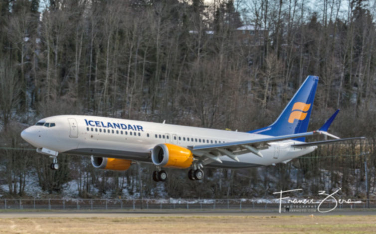
Absent from the new livery is the former yellow/gold accents and engine paint – Photo: Icelandair
TF-ICE, which was Icelandair’s first MAX, was also the first aircraft to receive the livery update. The next four scheduled to be finished and returned to the airline’s Reykjavik hub are TF-ICU on Feb. 2, TF-ICY on Feb. 9, TF-ICC on Feb. 16., and TF-ICB on Feb. 23.
The airline’s domestic fleet (formerly Air Iceland Connect before the March, 2021 merger), comprising De Havilland Canada DHC-8-200 and DHC 8-400s, will also receive the new livery as they cycle through heavy maintenance checks.
As for the color choices, Brynjólfsson said “the aviation business is very blue, and Icelandair was the bluest of them all. We wanted to expand the colors to pop out a bit from the rest, and bring the spirit of Iceland to the world – it’s not just blue and white – it’s multicolored and we wanted to express that in the brand.”
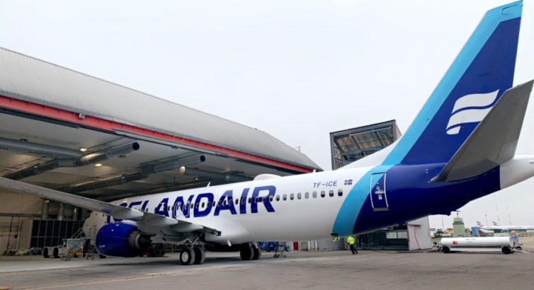
The first plane to receive the new livery was TF-ICE, which was also the airline’s first Boeing 737 MAX 8 – Photo: Icelandair
The rebranding process began in 2018, and was paused during the worst of the COVID epidemic. “I never participated in any project like this with so much resources behind it; everything we’ve done is based on research and experiments,” he said. Over 600 pages of documents were created, they asked 600 employees for their ideas, and surveyed more than 16,000 travelers for their opinions.
Explaining that the former brand strategy was too broad, he said “When you talk about Iceland, you go straight to the northern light and the landscape, but the spirit of Iceland is the people, and that is a much more interesting story.”
He said “blue and white are always going to be primary colors, but we definitely needed an extended color palette. We’re moving from basically four colors to the new direction, inspired by the northern lights and Icelandic nature.”
Brynjólfsson said the airline did brand surveys in Boston, Seattle, London, and Copenhagen, showing people just the logo and colors without the name.
When the people were asked for the name of the airline, he said that, “By far, people guessed the wrong name from the brand. People recognized the logo but didn’t exactly remember the right airline.”
“One of the biggest changes on the livery is that we’re making the name huge – we’re not reinventing the wheel, but I think this is absolutely necessary for us,” he said.
The design changes were also done in close cooperation with operations. “This paint job is more practical than the other one,” he said. “The belly of the MAX has been grey, but it’s going to be white now. That was done for practical issues for maintenance and cleaning.”
I really like it, and love their colors. Always been a fan of the billboard tiles.
I will miss the yellow nacels!
Sleek looking and gorgeous! However the old was nice too.