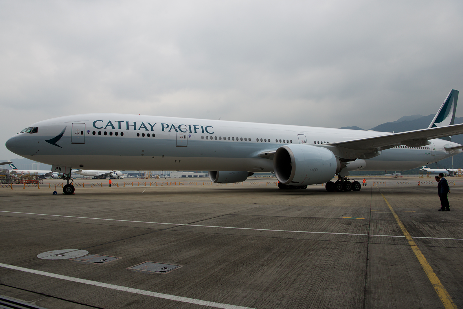
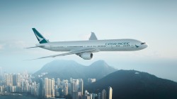
Cathay Pacific has unveiled their new livery – Photo: Bernie Leighton | AirlineReporter
Though there have been clues for over a year as to what Cathay Pacific was doing with their rebranding, it didn’t become fully clear until they recently unveiled it (including a new livery) in Hong Kong.
The previous hints were namely removing red from the boarding passes, corporate letterheads, and other places where customers may see the trademark “brushwing.”
There were even numerous rumors last year that a new livery was coming soon. That turned out not to be the case, but quite a bit of work was going on behind the scenes on the rebranding effort. Now, the world gets to see what Cathay has done to their aircraft.
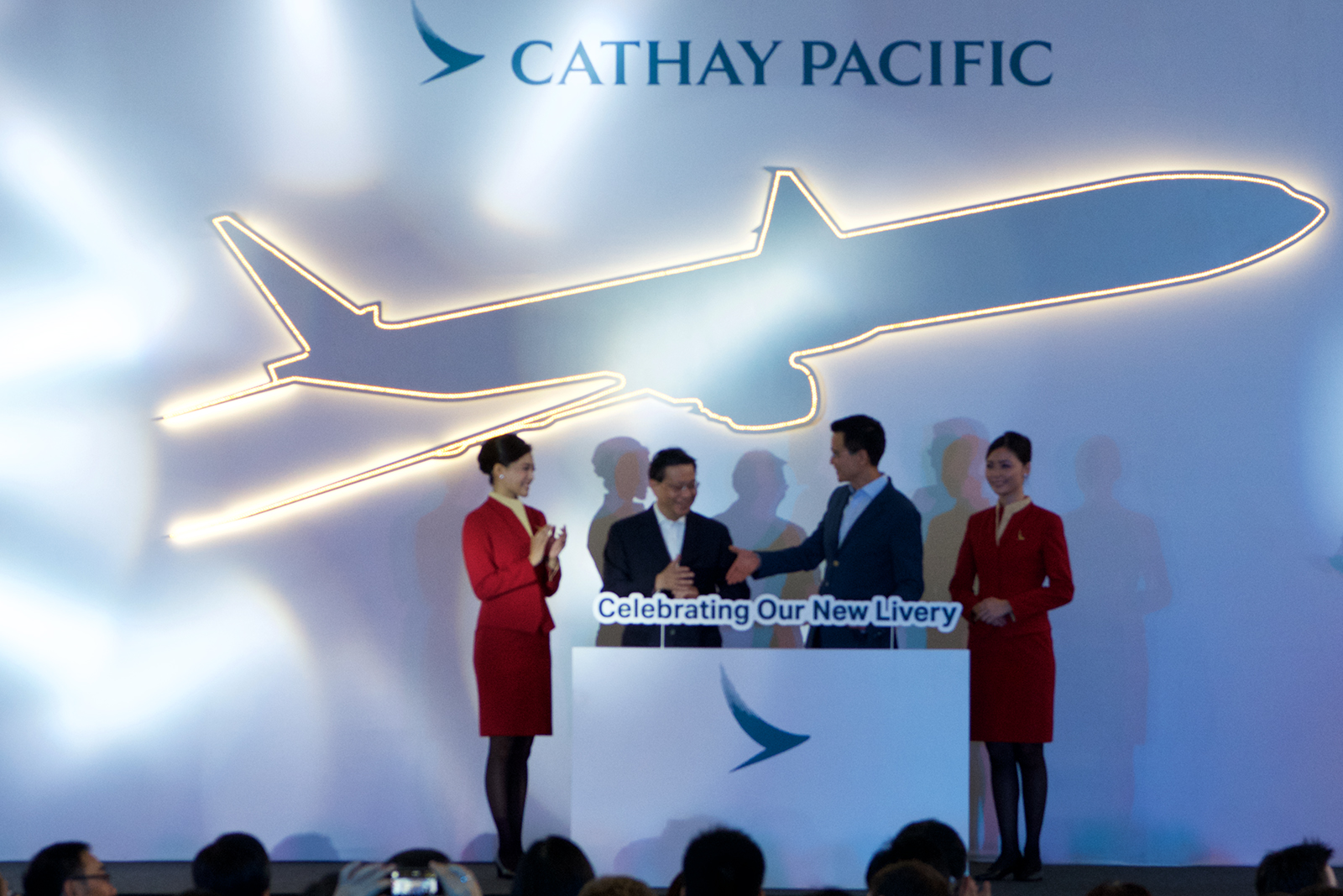
Cathay Pacific CEO Ivan Chu and Hong Kong Secretary for transport and housing Professor Anthony Cheung unveil Cathay’s new look – Photo: Bernie Leighton | AirlineReporter
If you took a quick glance and didn’t notice a change, that is not too much of a surprise. It’s a subtle change designed to update the Cathay Pacific brand for the future.
Ivan Chu, Cathay Pacific’s CEO, said that this new livery is a symbol of the company’s values; “the livery represents Cathay Pacific in and out of Hong Kong and every time our aircraft take off or touch down in our network of destinations around the world.”
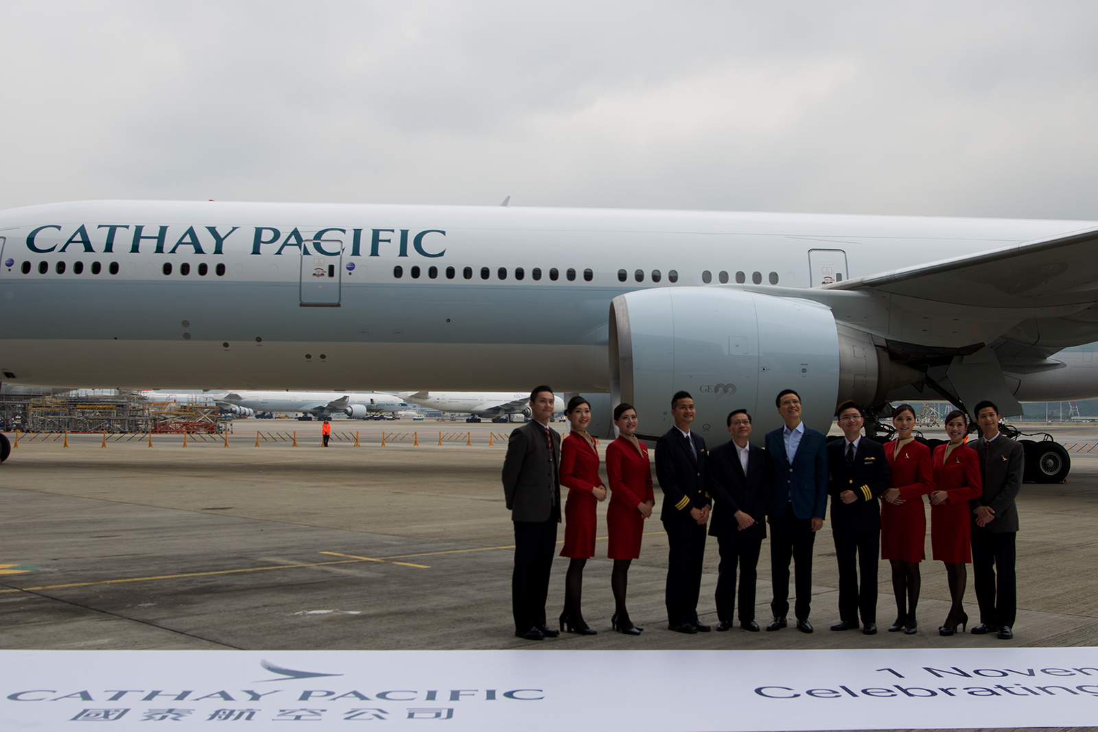
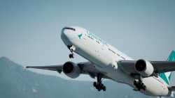
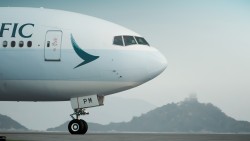
Cathay Pacific dignitaries pose with the newly-painted B-KPM – Photo: Bernie Leighton | AirlineReporter
Even though images of the new livery leaked online before the official reveal (this new world of many spotters, smart phones, and social media make it hard to keep this stuff a secret anymore), I was very interested to see it in person. The reactions I was seeing weren’t too positive and often a design looks best in person versus a computer-generated image.
The hangar doors opened to huge applause. The crowd was, after all, over 300 people. Many of them had been given odd looking inflatable noisemakers and things that said “#B-KPM” – it almost felt alien. Everyone was enthusiastic, but it did not feel genuine. It almost felt like there was a secret “applause” sign I couldn’t see in the media event.
Either way, it fell silent as the aircraft was revealed on the taxiway (facing the active runway and allowing spotters to photograph it hours before). Maybe this is a Hong Kong thing, but there was nothing but silence for the first few seconds. I think I can explain why. Hong Kong and Cathay Pacific are both vibrant and passionate. This livery was designed to be, and is, flat. Hong Kong is anything but. Even present-day eco-minded Hong Kong. It’s a vibrant city of colors and lights. Consider Etihad’s “Facets of Abu Dhabi.” If Etihad can be bold, so too can Cathay. It is not a bad design, but doesn’t seem to match the vibrancy of the city that the airline is based.
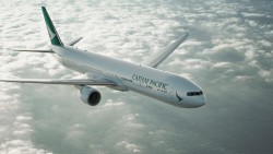
All photos above from Cathay Pacific
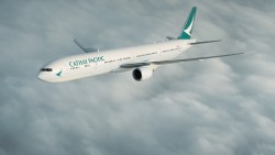
The most crucial changes, in the eyes of the designers, were those to the brushwing. As you can see, it has shrunk in width. It is now, also, on an entirely green background. What is hard to convey in images, however, is that the green is gradiated and gets darker towards the aft edge. The other change, the reposition of the brushwing on the front, had a more interesting rationale. According to the designers, they want the brushwing to be the first and last thing passengers see in their interaction with a Cathay Pacific aircraft.
All of Cathay’s new A350-900s and A350-1000s will be delivered with this livery, and over the next five years Cathay’s fleet will be repainted.
So, what do you think of the new livery? Too much of what it was previously, or a good way to refresh a design?
Note: Cathay Pacific provide travel for this story. Opinions are my own.
Comments are closed here.
Agreed – a VERY understated ‘new’ livery. Too bad; CX might as well get rid of the pale green fuselage cheatline altogether as it does nothing for the overall image, IMHO.
I like the tail and the much bigger titles (the current titles are so small you could be forgiven for missing them completely!), but the fuselage lack of colouring makes it look insipid.
Actually I liked the outgoing livery better. This new one is just too bland and blah.
Reminds of Alaska’s update….very little actual change.
I think these are better
http://i.imgur.com/hkPBBcJ.jpg
https://38.media.tumblr.com/733c784bff8f8d2085f6c32b5d0cc949/tumblr_neguhwW3HT1s12f1yo1_500.png
Photos of B-KPM can be found on airliners,net; arriving at Haneda on its FIRST FLIGHT since its re-paint.
I also prefer the outgoing livery, however, I do kind of like this new one also.
It’s elegant IMO.
Wishy washy plain plane.
Bland; agree could have been bolder. at 1st sight a deja vu and later realised i saw the similar tail in Turkey on that LCC of TKs
Totally uninspiring. Step down from previous livery. Perhaps reflects Hong Kong’s diminishing stature both internationally ans as a Chinese city. Shareholders of the airline should question the rationale and costs for such uneffective marketing.
Great livery – elegant and classy. I love it!
I’m a minority of one; I understand that. A clean, simple, minimalist livery is (almost) always the most pleasing to my eye. IOW, I like what Cathay has done and I think it will serve them well. -C.
Another boring updated livery, the current one is much better especially the tail and better yet the green striped livery prior was the best yet for CX!
I loved the way cathay has updated their livery.this makes them very classy and somehow generates a respect for the bland treatment. Bold and bright liveries look very LCC and cathay has done good by avoiding a garish and bright paint job.
Everything should have changed. Cathay Pacific too me other than the colour is very old school CPAIR. i would liked to have seen a whole new colour scheme like what Air Canada did.