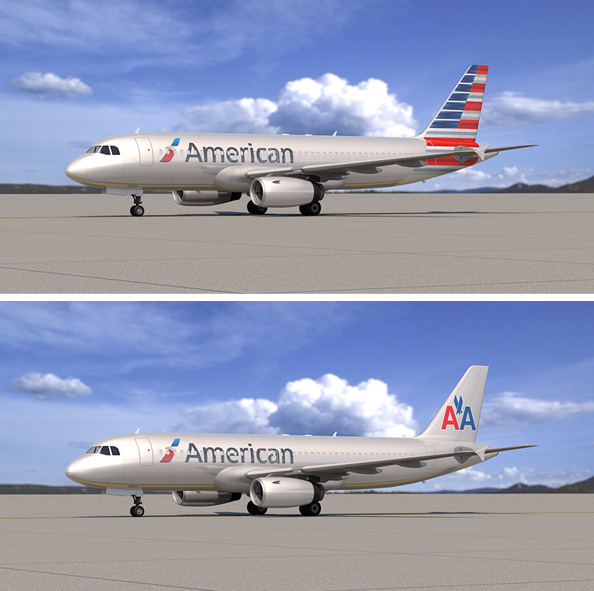
Do you like the #NewAmerican or the #NewNewAmerican livery? Image: American
According to the Dallas News, American could be changing their livery… again. The possible alteration in the livery only deals with the tail. The choice is to either keep the current artistic flag, or to go back to the classic AA with eagle design. Who gets to decide? The new combined American Airlines’ employees.
“As we build our new company, we want all of our employees to have a voice in who we are as an airline, and that starts with what we look like,’ Doug Parker, the new chief executive officer of the American Airlines Group, wrote in the internal newsletter to employees. ’œAs such, today we launched a survey for all employees of the combined company to vote on what we should do with our new look for the tail ’“ keep the work that was done, or go back to the previous American.’
Parker made it clear that the option of a complete re-design of the livery if not on the table. “However you may feel about the new livery and branding, the fact is it would be irresponsible for us to start over from scratch. There are currently more than 200 aircraft in the new livery and the new flight symbol or, ’˜eagle’ as it’s sometimes called, and the related signage is up in many airports and facilities already.”
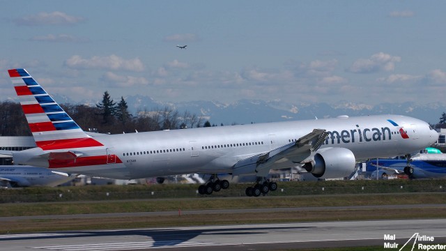
The new American livery might not last that long – Photo: Mal Muir
When asked which livery Parker would prefer, he responded by saying, “I honestly do not care. I think both look fantastic. As someone who began working at American in 1986, I, like many of you, am fond of the AA and think it reflects the proud history of this airline. But I also think the new branding looks great. It is bold, professional, fresh and represents American well. And the more aircraft I see painted in this scheme, the more I like it.”
BONUS: Some Additional Thoughts on American Airline’s New Livery
To the delight of AvGeeks, it was stated that, as done at US Airways, a plane will be painted in retro-airline liveries, including the classic American design and even TWA. You can read the full message to the American employees here.
MY THOUGHTS ON THE POSSIBLE LIVERY CHANGE
Employees of American, please do not change the #NewAmerican livery. I have not hidden the fact that I was not a fan of the previous American livery and that I have been one of the first to say that I like the new one. Even with setting all of that aside, I am shocked that this would even be put up to a vote.
Before the merger, American was working hard to re-brand themselves, from an old legacy airline to one that had a fresh new product, aircraft, and look. It seems silly that all the money and time put into getting people to buy into the new livery could be lost.
BONUS: My Review- Flying Business Class on American Airlines 777-300ER
Yes, there were many who resisted the new look, but many of those have come around to appreciate and even admire the new look. I could better understand if this “new” livery choice would at least try to incorporate something from US Airways’ scheme, but mixing a very classic design with a modern look just will not work.
I am begging you to please not make this combination livery. The older AA does NOT match the new livery and it just makes it look like the airline doesn’t know what it is doing.
So what do you think? Is this a smart move? Should they go back to the classic “AA?”
From a branding perspective it doesn’t make much sense to have two logos in fact it’s often harmful for image… That goes double for having them both on the same livery, the new american logo down the side and the old (boring.. Sorry!) AA on the tail. I don’t much care for the flag design, but if the old AA is my only choice, I think we ought to stick with the New American in all of it’s two-stripes-short-of-a-full-flag glory.
You should not be shocked it is put up to a vote. It has been very controversial internally and as the new CEO, Mr. Parker not only got rid of assigned parking at Headquarters for Officers, as well as security on the CEO’s floor, he is allowing the employees to put it to rest. Good move.
Don’t mix the two logos! Keep the new one. I don’t love the new design however it’s better than the old and way better than mixing the two.
Having the two different fonts seems really silly. The “A” in “American,” and the “AA” on the tale look bad together. Both logos are valid, but putting them together is not.
The mix looks like a striped down version. Is that a sign of the service to come from the “new airline”.
I was personally thinking leave the Eagle in the front BUT put the US Airways tail. That current tail AA has is just too much. Kinda of like a disco gone wrong. Or bring back the white that US Airways has with the Eagle in front and the US Airways tail.
It’s like downgrading (again) to the same lame old fashioned American Airlines!
Goodbye future and helloooooooo oldie!
What will be next?
Survey to the employees of what they think about the merger?
Should AA go back to same old computers (ICOT)and teletypes?
Should AA go back instead of ticketless to writing tickets?
COME ON GUYS!
THIS IS THE 21ST CENTURY!
IS THIS WHAT YOU CALL,B-R-A-I-N-S-T-O-R-M-I-N-G ?
After seeing a large number of the newest livery planes in MIA, I say keep the new one. The planes look new and the dents and scratches are better hidden as well.
That so called flag on the tail looks ridiculous. Go back to the original. Classic does not go out of style.
I agree. The new tail design looks too blockish and it spoils the lan of the classic look. If they want a more colorful design on the tail that’s fine but the flag should be more artistically drawn, maybe a little smaller and with a wave or two, with some of the silver-grey background on the tail left for contrast.
The tail isn’t the problem with the new livery – its the odd “American” font.
One logo that should be brought back is the United tulip.
I DO NOT like the New half painted whatever its called on the tail ! Theres really nothing artistic about it. It looks cheap, and 1/2 assedly done, the stripes just quit, they should finish going down the sides of the fuselodge.
if that’s what some refer to as artistic, well then poor taste in art and graphic design.
American Airlines should hire a REAL Artist who’s very knowledgeable in custom logo design and well known in the Sign Painters industry, his name, is Bob Hollywood Bond : http://www.bobbondart.com/oldsafes1.html
http://bobbondart.com/
Amusing I guess. Does it really matter? Does anyone really care? The big “American” splash on the body makes it rather obvious who they are. With many more hundreds of airframes to repaint, let’s let the tail flag alone for a while; The New AA has a lot of issues that need faaaar more attention, and a lot sooner. Please Ms. or Mr. Airline God, let them focus on the IMPORTANT issues, first. Both of the former airlines need major attention to the domestic as a public thing as well as Gig Time attention to melding two different unions (or none) into one. Hello New American: Please make the systems work and the staff happy, before messing with the pig’s lipstick.
I didn’t like the new livery when I first saw it on the B777-300ER (too much grey fuselage between the name and the new flag tail). However I soon came round when I saw it on the B737-800’s. The new A319’s and A321’s look good too. Putting the ‘old’ logo back on the tail makes it look too bland and mixing the font’s just doesn’t look right at all. Then there’s the cost of repainting the aircraft already done. For an airline just emerging from Chapter 7 it makes no economic sense. I say stick with the new, it needs that colourful tail.
I dont see too much wrong with the logo and font on the fuselage – but that tail design is awful – the obvious move would be to put the new stylized Eagle on the fin where it should be
Kevan,
Have you been able to see the new tail in person yet? I find that most people who are able to see it in person (myself included) are able to have more of an appreciation for it. Photos just do not do it justice.
David
no I haven’t – see my full reply below
Keep the new one. As a former AA mechanic, I loved the polished fuselage with classic cheat line. but the new one has grown on me. Keep it.
keep the new one, but change the tail to reflect the new eagle. The stylized flag was an interesting effort, but doesn’t match with the new logo. Mixing the old AA tail with the new design is an awful idea; first it makes for a confusing brand message (are they the new AA or the old AA), second, the old tail and new logo are completely different in style, font, etc, as such look very disjointed.
I totally agree. I wish AA would put the new eagle on the tail instead of the flag.
It makes for a clean and modern look which is what AA originally strived for. I’m used to the flag look by now, but I still think it looks pretty bad.
Look at the DL logo, it’s really clean, but looks edgy without alienating the core DL customers. Please, AA, change the tail to the new eagle.
That was my impression too. The new font/logo up front wouldn’t make the font/logo in the back and it looks like a company where the left and right hand do not know what is going on.
David
I think that the “New” American Airlines should use the original “New” livery unveiled some months ago. That livery reflects the change to integrate US Airways into the AA brand (i.e., U.S. flag stripes evoke the presence of US Airways).
Does it really make the least amount of difference.
No one is going to fly, or not fly, based on a paint scheme.
All this does is give the employees and a.netters something else to argue over.
I think it does matter.
If it didn’t, companies wouldn’t spend millions of dollars to design, build and then change their brands around.
Some passengers want the sense of a legit and safe airliner to take them to their destination. If an airline’s brand looks old, out dated, or suspect, people will choose not to fly on them as much.
Now, will someone not fly on an AA plane b/c of a flag or AA logo on the tail? Probably not.
David
Thanks for stiratng the ball rolling with this insight.
Can’t get worked up about this, considering every choice I make in flying rests with price, schedule, and airline mileage plan. 99% of the flying public has no idea what plane they be flying on, nor what the tail might look like … but, consistency trumps this discussion. A consistent branding, well-applied helps – just as Delta has done the past ten years. I can see a hodgepodge of three different liveries with the new AA for the next five years – just as United demonstrated in the mess they created with over three different liveries on their fleet with the CO merge. But, with that said, amazing to me that AA would throw out one of the most recognizable AA Eagle logo’s in use for over 80 years! I bet the vote will be go back and merge both (bad pun).
Hi David –
No I haven’t seen one for real yet and although I take your point, I don’t need to. As a photographer, I understand the difference between the impression created by an image and how something can look when seen for real.
Taking the comments about whether or not the exterior makes any difference to most people who fly, perhaps it may not to many. But the image created does matter and, granted this is just my opinion, but the tail fin design looks tacky and plastic and as though it were drawn by a five year old. I agree that combining the old fin design and the new would be a bad idea. The solution, agin just my view, would be as I suggested – to use the new eagle on the fin. It would be much more stylish and evocative. I wouldn’t decline to fly AA just because of the current look however. But I do wish they would think again with that tail design…
I have often thought it was pretty audacious for us to lay claim to the term “American” when anyone from Canada, Mexico, or any other country south of that could also claim to be “American”. The tail emblem on the US Airways’ planes signify “this plane is from the United States”. Why not use that????
I like everything, but the tail. They should redo the tail with an eagle. The AA Eagle in the globe with american would be great.
As an avid AA frequent flyer, I think the New tail has grown on me.
I agree with the comments above about putting the old logo back.
Not only will the fonts clash, but AA have made a point of moving on..
so going back to the old logo would be poor judgement on their part, along with a hefty cost to repaint those 200 planes again!
If we are going to be the “New American”, let’s make it new. I absolutely love the new design; it does not favor the old American, nor the old USAirways.
Stay with he NEW!
Going back to a mix of the old and new makes no sense whatsoever from a branding perspective. I don’t hate the new tail but you don’t see it anywhere else in their branding and yet you then have this new eagle motif that looks designed for a tail but appears on the fuselage! I have to say I love this design from Tom Collins that’s been appearing in lots of places this week:
https://www.dropbox.com/s/1go92sq2glxk91h/aa-77w-newlivery2-mockup1a.png
The further the new AA can run from anything that reminds passengers of USAir, the better they will be. Dump the flag; go back to the classic. Not the type of thing you want to have employees decide — dumb move.
Hi, just want to say that the old new livery (not the new new) looks fantastic to me, even if I don’t know AA’s history very well (I know I know, I should be punished for that). I think that they needed some ‘fresh air’ in their paintings, as it looked a bit old.
I think carrying the Eagle on body and tail would be too much, and with nothing on the tail their birds would look like plucked geese (with all due respect).
So I would rather see the new paint scheme as it is: AA’s so famous metallic gray with the eagle escorting the ‘American’, and a big stylish US flag on the tail.
Looks perfect for a modernization, but that’s my opinion.
Anyone knows if AA’s employees have decided yet?
No don’t change it again. I like the new livery the old new one. Why we should change it again? It doesn’t look right. The logos are different. If the old one was on the fuse the new tail would be one the back. A330 hates AA he says, the livery isn’t half way bad, still hates the airline. Just keep the new livery?
it really stats AA is still confused on its direction.
It looks great on the trip7, but I cant get into it on the smaller planes.