
American Airline’s new livery on an actual aircraft: Boeing 737-800 (N908NN). Photo by Joe Statz. Click for Larger.
After some additional thoughts on the livery, I wanted to do a second post. I like American Airline’s new livery. Don’t hate me. It seems that most #AvGeeks out there aren’t huge fans. I have to say I wasn’t too sure when seeing the mock-ups of the Boeing 777-300ER, but seeing the livery on a real plane (via photo above), I have to say I like it.
Quite a few people around the internet like the concept, but hate the tail. But looking at this close-up photo of the tail makes me like it even more. I have also seen quite a few people complain that the tail only has 12 stripes versus the actual American flag having 13. No, this is not some conspiracy to over-throw the government. It is pretty obvious that the tail is a representation of the American flag and not an exact duplicate. I mean come on folks. Even US Airway’s flag on their tail has nine stripes, not the proper colors and no stars. Colgan Air had 6.5 (I think) stripes and only five stars.
BONUS: Quite a few additional “real” photos of the new American Airlines livery from USAToday
I come from the perspective of not liking their bare aluminum livery, which I know if loved by most people. Yes, it is classic, but it looks dated to me and made the airline look old (doesn’t help when it is on old planes). But American is making quite a few changes (merger with US Airways or not) and I think this livery matches their desire to change and move into the future.
I asked some of the other AirlineReporter.com writing staff their thoughts:
- “It’s boldly patriotic, a welcome and classy update,” Nick Smith.
- “I neither love it Nor hate it, it is a livery that is eye catching on the tail but still fairly plain. The new American logo reminds me of the tail design used on Aeroflot and i have heard references to numerous other similarities. The biggest thing this livery reminds me of is Virgin Australia using the southern cross on its tail as a bit of a patriotic feel, and that was just horrible to look at, hopefully this new AA livery makes some people happy,” Malcolm Muir.
- “Americans new livery is refreshing, to say the least. However, the design of the tail could use some tweaking. Something on the engines would be nice, too,” Jason Rabinowitz.
- “It’s fugly. The logo is amazing though and I love that but the tail just kills it. But I am sure, like JAL’s new scheme, it’ll grow on me. I feel that up-close the tail looks amazing. From a distance it’s an eye-sore,” Brandon Farris.
- “It’s bold to say the least. I know that American wanted to do something dramatic to drum up interest as they work their way out of bankruptcy (or via a merger). It’s not a bad livery but it just seems like the tail is a bit over the top and could have been simplified,” Colin Cook.
- “I have to say that I am really like the livery. It’s minimalist and retro at the front. The stripes on the tail definitely makes me think “America! Heck Yeah!” and I’m okay with that. Business in the front, party in the back. And like the mullet, very American,” Temo Madrigal.
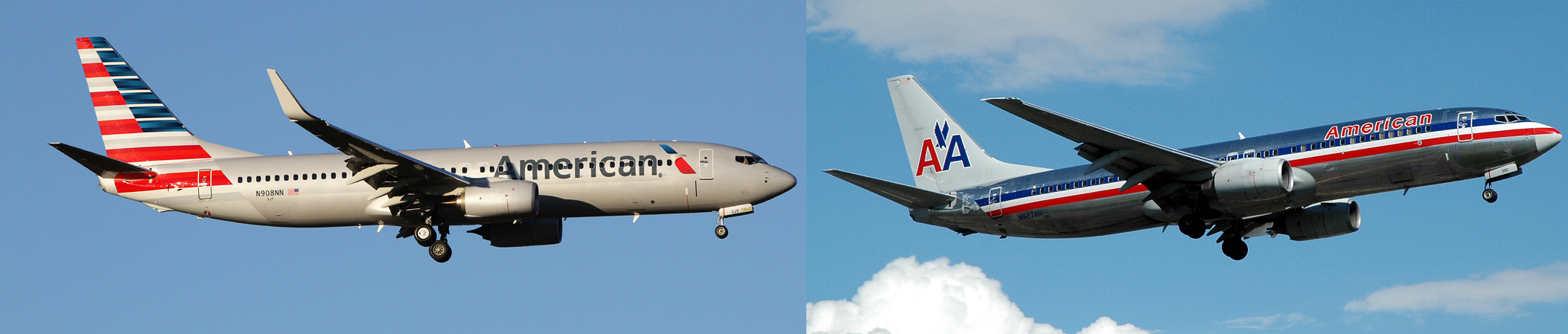
Look at these two. The new livery on the left and old on the right. Which one looks more modern? This give you second thoughts? Images- Left: Joe Statz Right: Caribb
Give it time. Like Brandon, I remember when I first saw the new JAL livery in concept form. I thought the airline had lost their mind. Seeing it in a photo, it was a bit better, but it really took seeing it in person (and a few months) to fully appreciate it.
There are many people out there who have a long-love for American and seeing such a dramatic change is challenging — I get it. But with the loss of so many airlines and liveries over the years, I think most will also learn to appreciate this livery. Trust me. My guess is it will grow on you — maybe.
And a huge thanks to Joe Statz for letting us use his great American Airlines Boeing 737 photo posted on JetPhotos.net.
 |
This story written by…David Parker Brown, Editor & Founder. David started AirlineReporter.com in the summer of 2008, but has had a passion for aviation since he was a kid. Born and raised in the Seattle area (where he is currently based) has surely had an influence and he couldn’t imagine living anywhere else in the world. |
Comments are closed here.
I’m a huge fan of the tail, but the generic font and eagle logo doesn’t make my blood flow any faster. That being said, American deserves credit for not going with Euro white for the fuselage. I suspect this scheme will grow on most people.
I don’t love it but I like it, one can feel there’s been work behind this livery!
Little Dudy from Paris.
It’s nice, but plain light-color fuselages are what EVERYONE is doing now. Cheatlines need to make a comeback.
I’d be more interested in what’s going to happen inside the tube!
BAM: https://www.airlinereporter.com/2012/07/not-your-fathers-american-air-great-interior-improvements/
Actually some pretty impressive stuff. We will get to see the new interior on AA’s 777-300ER that is first flying on Jan 31st.
David
Thanks David – I don’t fly too much domestically in the US these days – last was Jet Blue from New Orleans to Buffalo via JFK naturally – not too bad. Over the last 2 years (all flights economy) I’ve flown CX to HKG and MNL – impressive as ever; IAD to JNB and CPT on SAA which was very impressive; 2 flights LHR to YYZ on AC which were pretty lousy. Too bad as we’re off YZ to SYD on AC soon!
On long hauls I prefer carriers who fly Airbus for one reason – on the 330’s and 340’s there are two seats on the window side which is great for my wife and I. Seems all the 777’s and 787’s are 3 on the side – plus the coming 350.
While it does seem like 3-3-3 is most common for the 777, there are 2-5-2 configurations out there. American has them on the 777-200 (the -300 will be a tight 3-4-3), as does United, though they’re changing to 3-3-3.
For the 787, both JAL and ANA have gone with 2-4-2, while others are squeezing in 3-3-3.
Given the choice I prefer having 2 next to the window rather than 3 as well. On a 747 trip last year, I intentionally selected rows 60 and 61 way in the back, since the airline had only two seats for those last few rows rather than three.
Yes re finding the elusive 2 seats. On our AC flight to SYD I paid a little more for the 2 seats at the door. Decent compromise IMHO.
I think the big mistake is running the airline name across the windows, it looks like someone is trying to cross out the name!
I agree. Looks like the name is perforated or windows
peeking through letters like eyes. No issue with the fore slash brand
eaglehead. I feel an airline livery should be instantly likeable,
clean and fresh. Like LAN.
I am with you in really liking it a lot. You are also spot on that the tail looks even better, though obviously that doesn’t help much since most planes are seen at quite a good distance away.
Like most new things it will grow on people. I think they did a really nice job of combining American traditions with a little more modern look.
Also wish the winglets got some love too
I agree, that is sadly plane, should only be plane if it is a special scheme.
I meant Plain 😛
Maybe it will grow on me. Glad it looks better on the real thing. I do like the gray tone, the font and even the logo… but that tail will take a while. I love our flag, but it just seems too much at first glance. Thanks for the photo….. it helps.
Reminds me of Northwest’s livery.
The new look eagle makes me say “cool”.
The gaudy bill board style lettering makes me so “ugh”.
The tail makes me say “WTF”?
The flag was poorly executed. A flowing-in-the-wind look like how LAN, Emirates, Aeroflot executed it were far more aesthetic. The eagle logo as many point out, is awkward: I thought it was Carnival Cruises logo when I first saw it and its placement is peculiar (vertically too tall to be by itself in the front). Other airlines have done the oversized typeface bleeding over the windows but this one is far too low. I actually liked their all liquid metal look when they made that cabin interior 3D video, leaving it a surprise for everyone what they were planning.
Sign of the times perhaps? But their design has gone from classic but dated to boring and flat.
Still looks like either a Liberian LCC running a weekly flight between Monrovia and Lagos, or a charter operation out of Florida that schleps fat midwesterners to all you can eat buffets in the Bahamas in between transporting troops to Baghdad and Baghram air base.
Cheap, tacky, garish and boring all at the same time. Now that’s an achievement.
“Cheap, tacky, garish and boring all at the same time.” My thoughts exactly.
I’m OK with the sliver mica paint since bare metal is no longer an option. Maybe even having the billboard style “American” on the front, but perhaps in red or blue. But for God’s sake, ditch that hideous tail design (it doesn’t look any better close up) and go back to the AA with the eagle in between. At least JAL came to their senses and restored the crane to after that horrid red splotch.
As another posted earlier, spending however many millions it’ll cost to repaint planes and change out signage in hundred of airports is a lousy waste of money when you’ve been bleeding red ink for years. Were I an AA employee or stockholder, I’d be furious at the suits in Ft. Worth who thought this was a good idea.
As someone living outside the US, I have no particular attachment to the old metal tubes there were American Airlines. I think that with this design, you can immediately tell that you are flying an American airline, and that’s good. I think you Americans should be proud of this new design.
Not bad; not great. I guess it will do. For an airline struggling through the BKY process, I wonder how much this cost them in “Design Fees” and how much (extra) they will pay for having existing hardware repainted a bit sooner than is really necessary. In my view, the new livery is not bold or dramatic enough to justify the substantial costs, especially for an airline that could not otherwise pay their routine bills and was forced into BKY. In the end, it is fluff and mostly at the expense of AMR’s vendors who were left with cents (or nothing) paid on their routine invoices. While it may be routine business for the industry, it sounds like horrible fiscal management to me. Causing those many vendors to write-off millions in unpaid bills simply raises the costs for everyone, including those few airlines that DO pay their bills. I don’t much are about the new livery, but believe that it a colossal waste of real dollars, dollars that AMR ‘claims’ it does not have. At the end of the day, will ANY passenger buy an American Airlines ticket over another, because they have a new design for their pain job? Get a grip, people. In the end, YOU are the ones that pay for this silly stuff.
Horrible. The livery is clean and classy until one sees the tail. Horrible attempt to portray the American flag. America. Looks like a 5 grader with grid paper and highlighters. Way too busy on the back. Font section is clean and crips but the tail plane is a nightmare.
I thought the same, from a distance it doesn’t look nice but when you look at it up close it is actually pretty nice!
This livery looks like it evolved from a communist era state-run airline. My first impression was a flying barber pole.
If AA’s new design is patriotic, why is the American flag reduced to an abstraction that is beyond recognition? All I can say is that the new design is completely lacking the tasteful elegance of the old, and screams commercialism in a new toy sort of way. I don’t see anything wrong with making a subtle reference to history in the form of an aluminum body–a classic black dress a la Audrey Hepburn hasn’t gone in style since the time of Madame X (the famous painting by John Singer Sargent). If you find the new design unattractive, please sign this petition started on Change.org:
https://www.change.org/petitions/american-airlines-please-don-t-change-your-classic-design?utm_source=share_petition&utm_medium=url_share&utm_campaign=url_share_before_sign
AApalling!
A cheap design for a formerly-classy airline! I would feel very vulnerable flying overseas on the newly-livered AA.
I think it’s to political. It reminds me of Obama’s logo…
American Airlines must be desperate.
K
Gross. Not worse than the Delta interim livery Leo Mullin was so nice to bestow upon us @ DL, but pretty darn close. But like DL and the widget, I’m sure the scissor eagle will be back.
It’s awful. The idea behind it is a good one but the execution falls flat. It looks like a Greyhound bus to me. All that visual weight in the tail needs to be balanced towards the nose…I like the idea of tying in the engines and winglets. It’s unimaginative and feels unfinished.
American new livery is awful, inspiration from CUBANA DE AVIACION, looks the same company, americans lost his identity.
Sorry.
Alex
Terrible!!!, Cuban inspiration for American Identity ?
American Airline need to be more creative.
To be honest I’m quite pleased they’ve got a new look. American had been using that livery since 1968…that’s over 40 years. Most airlines change their liveries every 15 years or so!
At first I wasn’t too sure, but seeing it properly now I’d say it’s growing on me…there’s no doubt it will look awesome on the 777-300ER though!!
HORRID!!! 7th grade art students could do better. I was hoping that if AA changed its livery, that they would look to the old Lightning Bolt Scheme for inspiration. Instead, they gave us this monstrosity. Even worse, it had to cost AA a pretty penny to have someone come up with it, someone who is doubtless laughing all the way to the bank.
Thought process in action:
– “It needs to say ‘American.'”No problem, we’ll just paint a big, “American,” on the side of the plane! Problem solved!”
– “It needs to look unique. Okay, we’ll paint it mica white like Virgin and the old Northwest. No one will remember that!
“It needs something red, white and blue. Hmmm. Got it! We’ll paint something in those colors on the tail. You know, like Aeroflot! That’s a great airline. Let’s look like them! Communist-founded airlines are super to imitate!”
Seriously, AA needs to go back to the drawing board, and whomever came up with this so-called livery needs to attend AA.
Biggest mistake since Air Canada painted their planes toothpaste blue!
The AA logo is one of the most recognized logos in the world. Why fix what’s not broken?
Saying that this paint job: “will grow on you” over time…..is not saying very much, I mean, fungus grows on people as well, it doesn’t mean it’s good for you. Yes, a new paint job was badly needed at AA (they also need a complete culture change) but, did it have to be this one???!!!!…..I think not.
Where is fhe creativity in this livery? but more importantly, WHERE ARE THE ICONIC DOUBLE A’s???!!!! American will now look like, a new Low Cost Carrier or a foreign airline, it’s not bold, it’s not fresh, it’s not new.
Where is fhe creativity in this livery? but more importantly, WHERE ARE THE ICONIC DOUBLE A’s???!!!! American will now look like, a new Low Cost Carrier or a foreign airline, it’s not bold, it’s not fresh, it’s not new.
It`s awful !!!…It looks gaudy and cheap. The dull gray makes it look like a military plane, and the “AMERICAN” in light black is not pleasing to the eye, with windows cutting into the letters. The tail ?? HORRIBLE !!! I can`t believe they went for this design ! They could have given the job to me for cheap and I would have come up with something alot better. One problem with the tail is that it extends below it onto half of the fuselage. Not cool !!
I hate it. Whoever designed this new livery needs to take a graphics class. Why paint he fusdelage that dull gray color ? White is much more pleasing to the eye and a white fuselage creates a clean look. This is just plain DULL, and the tail ? AWFUL !! A flowing flag design that does not extend beyond the bottom of the tail would have been alot better. It just looks gaudy and too busy. I`m sure they paid mega bucks for this cheap look. And the “American” at the front needs to be raised higher and painted blue or red, but they went with black ???? I don`t like it now and I won`t like it later, nuff said.
Nice try at “change” but I think I’ll stay with what’s proven from past experience. AA needs to go back to the retro paint job. It gets rave reviews from just about everyone I’ve spoken to concerning it. The new paint scheme is just awful in pictures and in person!!! In one word…..cheezy
I am glad AA finally upgraded their livery, but I am not a huge fan of this. For one, I think they made a huge mistake by eliminating the Massimo double AA logo with the eagle in the center. That logo was just too beautiful and too iconic to do away with. And the flight symbol just doesn’t do it for me. It looks like something out of the dollar store. And the tail, while I usually love bright, bold primary colors, is hard on the eye and doesn’t really look like the flag. My suggestion would be to keep the AA logo. Then simplify the tail. Make is a nice navy blue and in the center put in a scarlet AA logo. You can add a few (not 100) wavy blue or red lines to represent the flag. Look at USAirways tail before the merger, or google up New Republic Airways livery. Something like that would have been good in my book. It would still look patriotic, but not be so busy. I really like the way Republic wrapped the blue tail around the fuselage. And how about painting the rear stabilizer red– a great retro throwback to the lightening bolt livery of the 50’s. Just my take on it all.