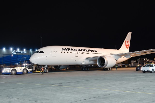
HI RES IMAGE (click for larger). JAL's first Boeing 787 rolls out of the paint hangar in new livery. Photo by Boeing.
From Boeing’s press release: “The first Boeing (NYSE: BA) 787 Dreamliner to enter service for Japan Airlines (JAL) rolled out of the paint hangar last night. The airplane’s livery features the iconic new brand mark on its tail and underscores the airline’s commitment to provide the highest level of service to customers and contribute to the advancement of society. The logo is a distinct symbol of the airline which was the first Japanese carrier to fly internationally from Japan since 1954.”
This is the new livery that JAL first premiered on one of their Boeing 767s back in March 2011 and was shown off in drawings in January 2011. JAL already had multiple 787 Dreamliners painted in their older livery at Paine Field and it was assumed that they would be re-painted in the new livery before delivery.
The resurrection of the crane is to match the airline’s, ’œnew philosophy and corporate policy which underscore the company’s re-commitment to provide the highest levels of service to customers and to raise its corporate value in order to contribute to the advancement of society.’
I have seen the livery in person a few times now on 767s and 737s and I have to say I am still not a huge fan of it. I am okay with simplicity and I realize this is a cultural thing with connecting with the airline’s roots, but give me a swooping cheatline or something. Although it does look better on the 787 vs the other aircraft I have seen.
What do you think of the new JAL livery on the Boeing 787 Dreamliner?
I’m sorry. The new JAL c/s is very poor, it’s a shame. (I don’t want to say cr*p here). Ok the crane is back but the c/s appeals to pessimisn. Almost no colors. The prior c/s is way better.
Agree with Ron747. Looks like Turkish Airlines colour scheme, but not as nice.
Pretty bland for my taste. No imagination at all.
The new JAL paint job on the 787 is very plain.It’s a shame!
Bland as rice but uplifting as a Cranes tail. If the whole airplane had the Crane motif from nose to tail including the outstretched wings then you would have something. The Crane should be flying above the horizon to see the whole world. My $.02.
Its a bit boring and bland. I like the crane, but it needs more color. I would have liked the crane on the tail, and the existing JAL logo on the front of the aircraft – a combination of the current with the crane.
It should have like this http://www.aviation-design.net/?id=13964
Awful livery, but better than the utter garbage Continental livery that’s infesting United planes.
Elegant in it’s simplicity. A winner!
Rubbish with no imagination.
I love the crane, but they could have done something with the fuselage other than a charter carrier all-white scheme.
Just terrible.
Much prefer the elegant crane to the meatball logo. Not a fan of the white whale look, fuselage desperately needs some color. Even a skinny line like EVA’s old C/S would be a plus. Pray JAL never orders an A380 in this livery.
You have a whole body and wings of an 787 as your canvas and a Crane. Now go and paint something like this on the aircraft and be the best.
Link:
http://t1.gstatic.com/images?q=tbn:ANd9GcTeJ0InIq92-e-ZwM7djy_EuoyAuXtmij4dhW0oXXLRzVKPSvydvA
NO Thank you.
Any idea when the company will start deliveries of Dreamliners to JAL?
It looks OK on the 787. The 767 is just not a pretty aircraft.
There are plenty of example of simple all white liveries that look elegant and/or modern by using an interesting font, or more color on the tail, or even minor color extension into the fuselage, or color on engines. (See Swiss, or Vueling, or LH…). In Jal case, none of this applies. The all black, all caps font on a white might be simple, but it’s neither elegant, nor modern, and makes the aircraft look like it is in a temporary livery.
Reminds me of PanAm’s final livery. I like the return of the crane but the fuselage is just blah.
What was wrong with the livery JAL adopted for the 90s?it’s miles better than the tail logo introduced a decade ago sporting a bit of a boring red circle and JAL minus the grey line and red square,at least the previous look
was a lot more profesionnal and to my mind summed up a proper Japanese Airline look,why can’t they just do what Air India did and revert to this
smashing design?
Crane is symbol of Japan. JAL is flag carrier Japan like Pan American World Airways. If you know history of international carrier in 60s and 70s over Trans-Pacific, the you would understand.
Finally return Crane. I’m sure all people of Japan is waiting for Crane to fly high forever.
One cheat line of red + black would have helped this bland white whale, but agreed on Crane treatment tail fin. Not screaming creativity here.
I love the Boeing name, I wish I work for Boeing.Before I had worked for C&D Aerospace and Weber Air Craft, but now I am taking difference major that is Accounting and finance.