Alaska employees cheer on the new livery
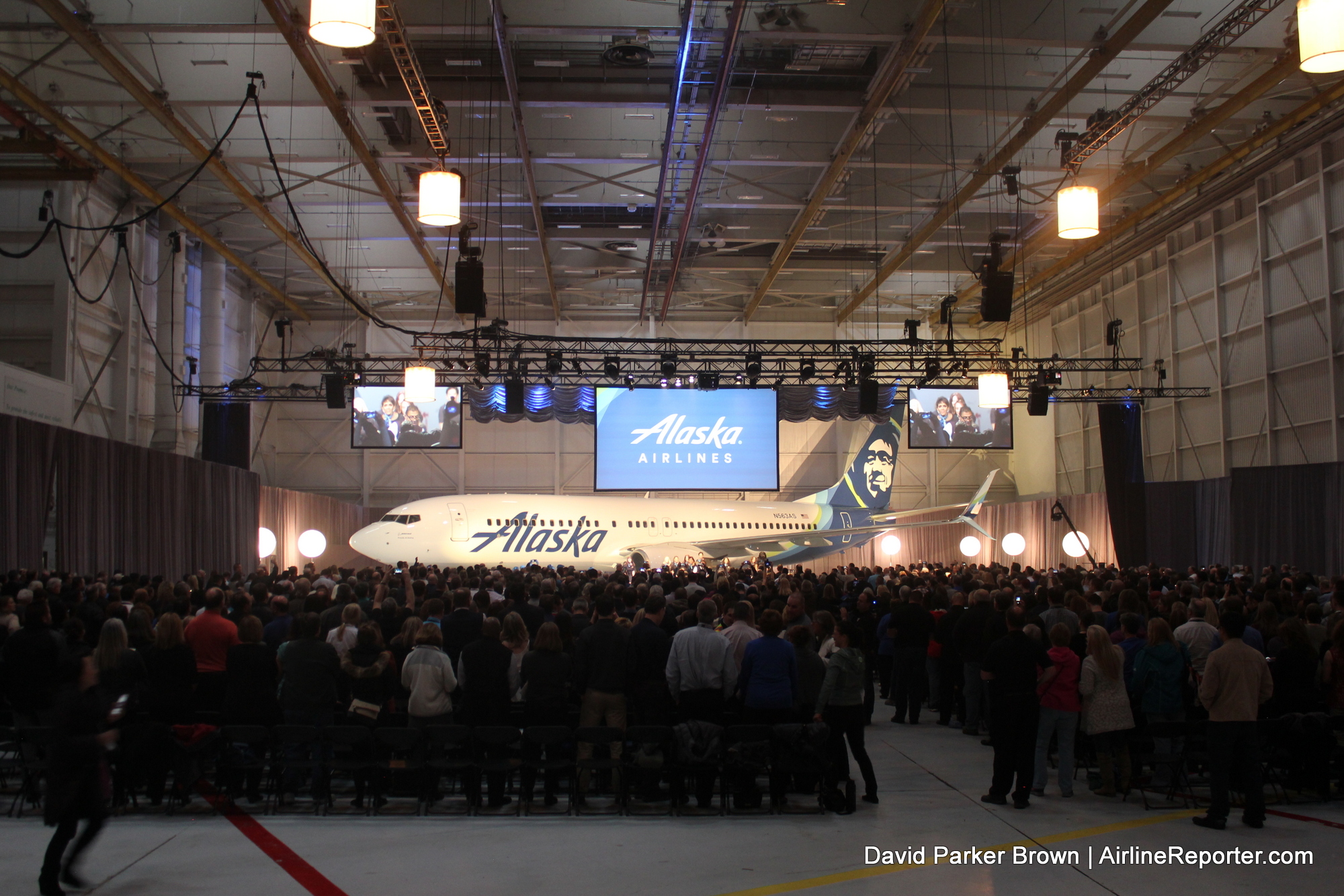
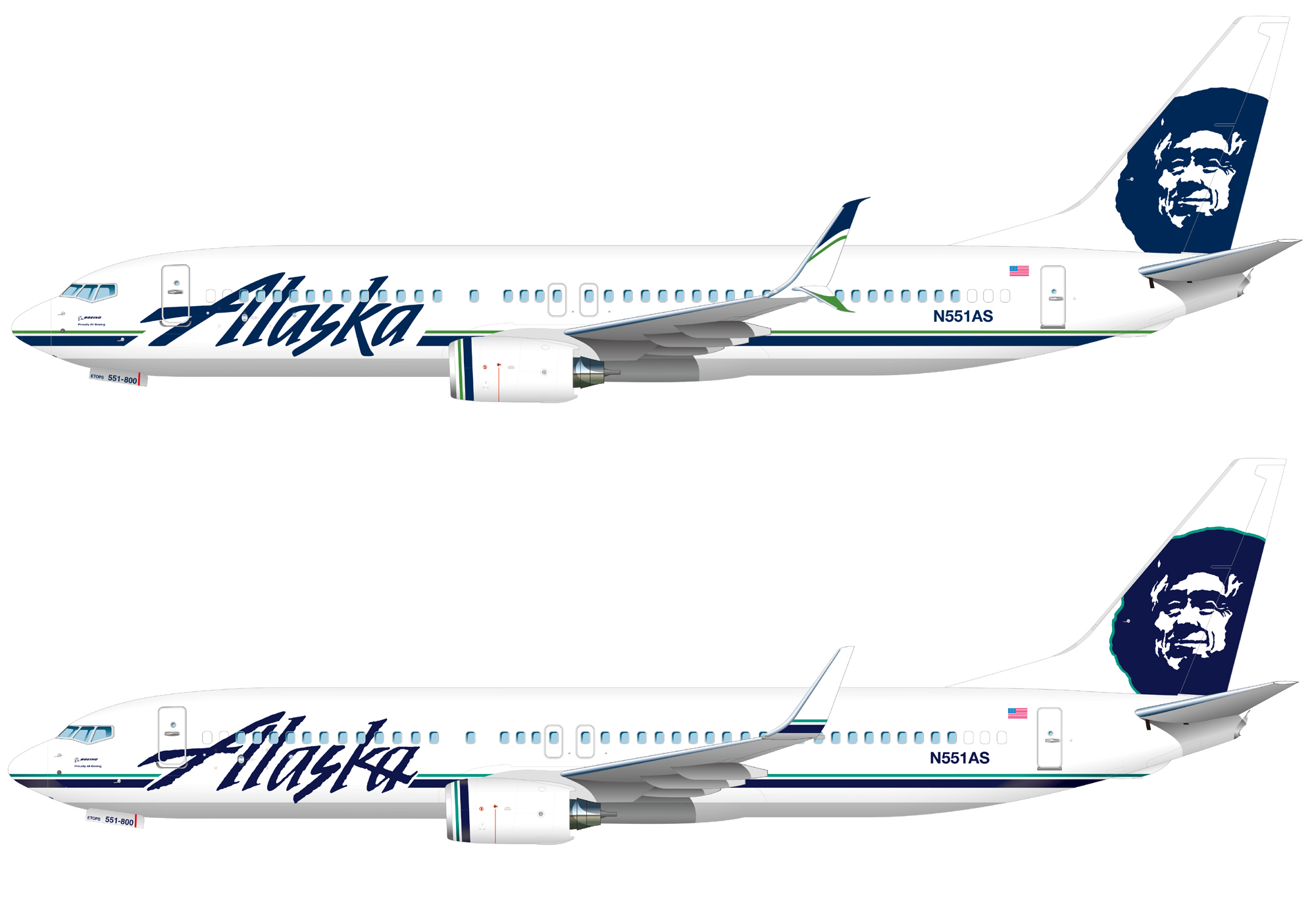
Earlier today, Alaska Airlines unveiled a new look, livery, and brand to 1,800 employees. The branding is noticeably different, but still is easily recognizable. Fresh, clean, and more of an evolution than revolution. I like it. I actually really like it.
BONUS: Checking out the new Boeing Space Bin on an Alaska 737
There have been rumors and talk (especially more recently) about moving to a new look, but it was uncertain how dramatic of a change it would be. Would the Eskimo stay around? Would the colors be the same? Heck… would the name “Alaska,” even be their name any more? It seemed everything was up in the air (heh).
-
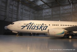
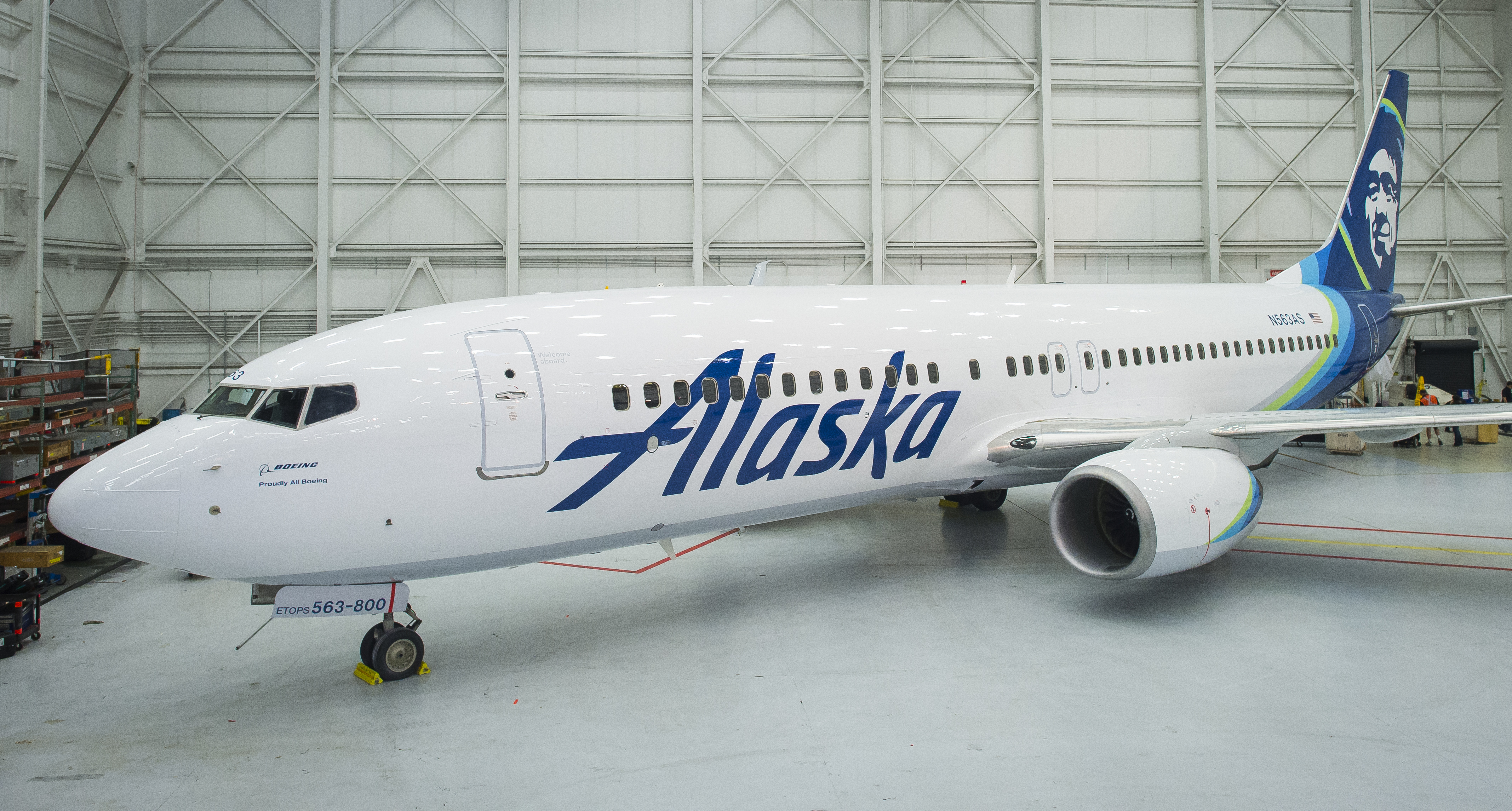
- The Alaska titles
-
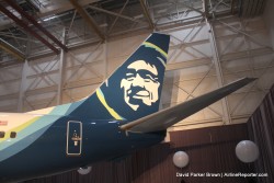
- The Eskimo stays
-
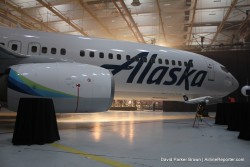
- The nacelle sports the new colors
Before the official reveal to the employees, media was able to get a look at the plane (photos were embargoed until 3:30pm PST). My first thoughts… I think it is a great move. I also know that it seems that no matter how nice a livery might look, many AvGeeks automatically dislike change. I always say to wait a month or so before making final judgement. But I can say that I think many of you are going to like this new look and brand in person when you first see it.
Recently, Alaska did some minor updates to their livery – Image: Alaska Airlines
I do not think the current (or most recent) branding is bad per se, but it is surely a bit dated. Just recently, Alaska updated their look, but not by much. These changes included minor tweaks to the “Alaska” font and a slightly different shade of green on the striping. Most people wouldn’t even notice. People will notice this change — and it is more than just a livery.
BONUS: Flying a flight to no where to check out Alaska’s “Beyond” product
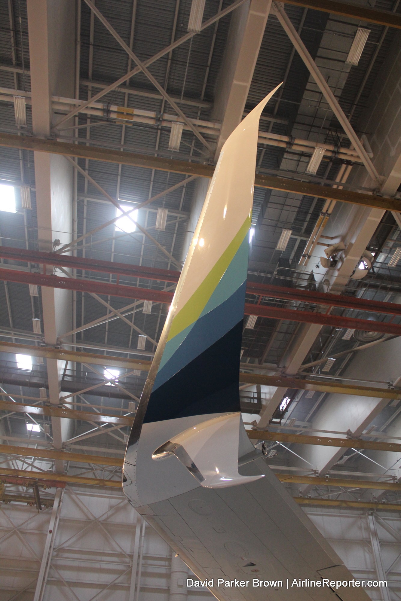
The updated winglet
Not only will the aircraft sport the new livery, but there will also be brand changes throughout Alaska’s operations. The website, mobile app, mileage plan, and credit cards will all be updated to reflect the new look. Starting tomorrow, travelers flying through Seattle-Tacoma International Airport will also notice the changes in branding, since Alaska will be updating things tonight.
-
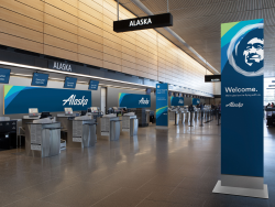
- Branding at SEA
-
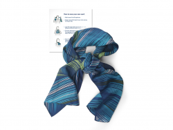
- New flight attendant scarf
-
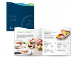
- On board menu
’œOur company has a unique personality and a vibrant spirit that our Eskimo has personified for almost half a century,’ said Alaska Airlines CEO Brad Tilden. ’œWe believe our refreshed look reflects the warm relationships our employees have built with our customers, and makes us stand out in a compelling and consistent way as we expand into new markets, build loyalty, and attract new customers.’
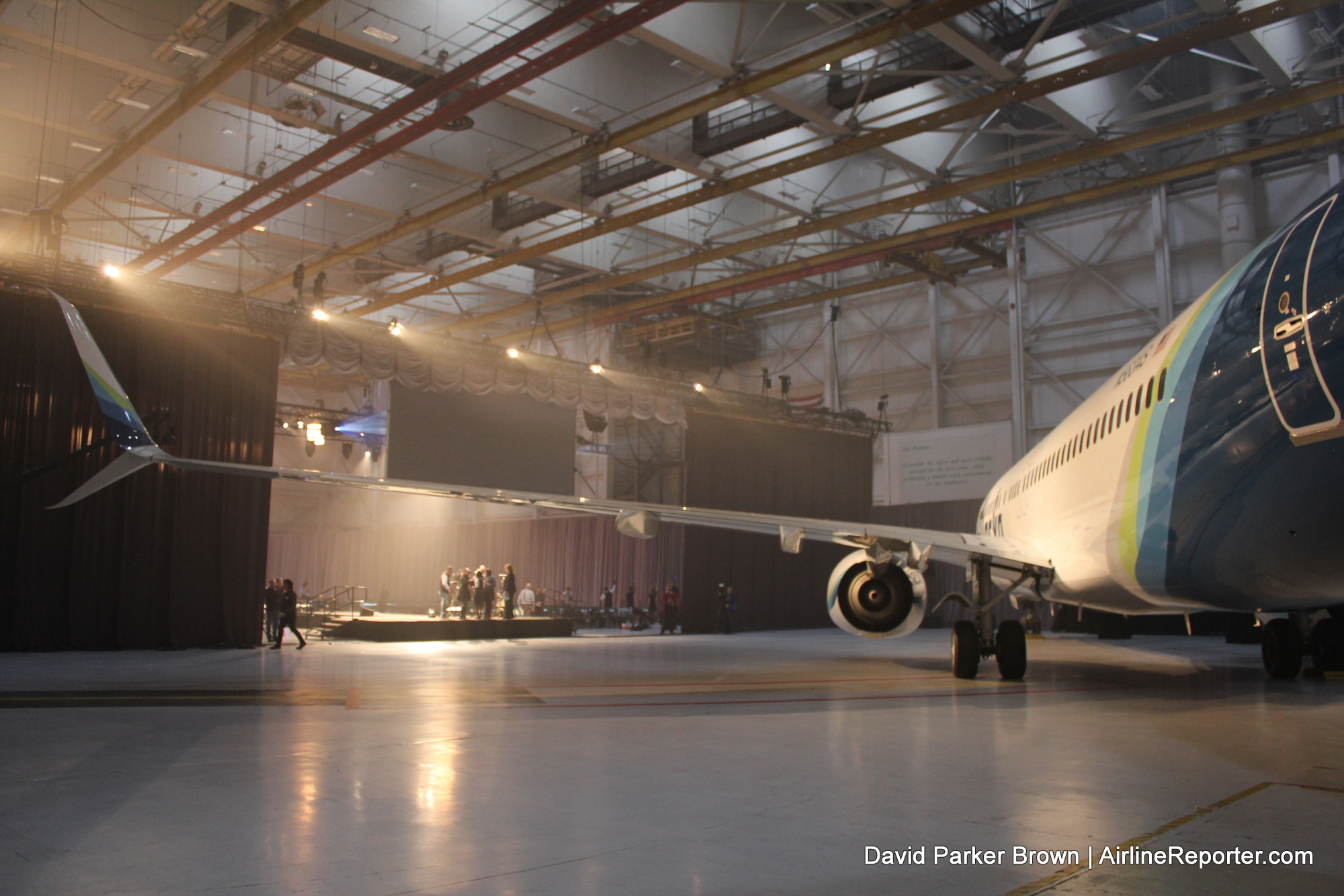
Before the new livery was revealed to the employees
BONUS: Flying high at ground level – checking out an Alaska 737 flight simulator
Alaska has slowly been updating their brand and product, with free entertainment, just-released Hollywood movies, Tom Douglas signature onboard entrees, and seatback power. Partner these changes with more Boeing Sky Interiors and the new Space Bins making their way into the fleet and this is a pretty impressive combination.
-
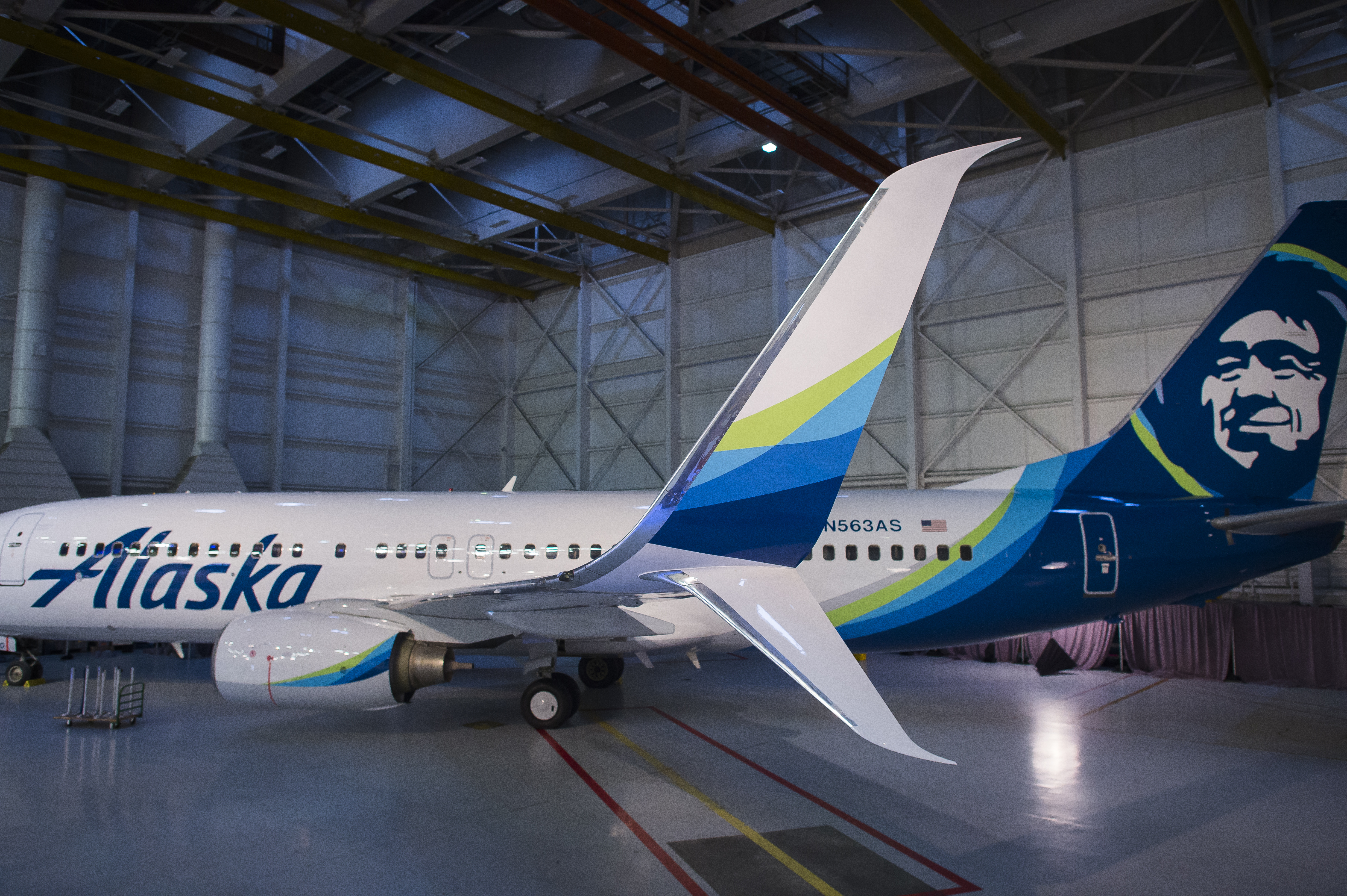
- Updated winglet – Photo: Alaska
-
- Better lighting of new livery – Photo: Alaska
Let’s just be thankful (at least for those of us who are fans of Alaska) that the new branding did not include a widget. But what do you think? Like it? Hate it? Or meh? Share your thoughts in the comments!
Wants more pics? Of course you do! See more photos of the new Alaska Airlines’ livery on our Flickr.
Wow
Like!
Niiiice one mate!
She looks a beaut!
Happy Australia Day!!
Far better by far. Some more color was long overdue for an airline that represents such a beautiful place.
Love it!!! Seeing Alaska evolve through the years… From ’87 to now.
I’m glad they kept the Eskimo, not crazy about the new font, I liked the old one better.
As the son of a pilot I was surprised to see such a drastic change. New color scheme, new menus uniforms and kiosks, new Eskimo. I didn’t see this coming. I think it looked better with a stripe of color all the way down the side, but I like the new colors over the old ones. Eskimo looks better surrounded in color, and nacelle/winglet color is nice too. I think it is a good change. Now I wonder if the inside of new planes will change at all.
Hey Patrick,
Alaska has been slowly updating their interiors for a while. New 737-900ERs are coming with the Boeing Sky Interior and Space Bins. Alaska has also been improving their food, in-flight entertainment, and service training.
David | AirlineReporter
I think a subtle grey silhouette of a mountain range on the fuselage would’ve been nice. I think it is exciting, but also looks like it would be more fitting for a south american carrier or something. I’m also disappointed that I’ll be losing my northern lights Alaska visa card. A change was necessary and it is nice to see such an awesome company get a face lift.
Most Alaska Natives consider Eskimo a perjorative and prefer to be called either “Inuit” or terms that refer to a specific tribe. Given that Alaska is a U.S. carrier, probably the best current term to use is Alaska Native. As in “I’m glad Alaska Air kept the Alaska Native on their planes’ tails, he’s a cool, distinguishing feature.”
If it’s good enough for the CEO of Alaska Airlines to refer to the image as an “Eskimo,” that’s good enough for me.
Alaska Airlines CEO Brad Tilden has now apologized for describing their aircrafts’ tail character as an “Eskimo”.
From the Alaska Dispatch News:
”When Alaska Airlines unveiled our refreshed brand earlier this week, a reference we used, Meet our Eskimo,” offended many in the Alaska Native community, and likely others,” said Alaska Air Group CEO Brad Tilden in a statement. ”We apologize and take full responsibility for this insensitive reference.”
http://www.adn.com/article/20160128/alaska-airlines-apologizes-removes-meet-our-eskimo-phrase-website
Dang, on closer reading, my post above is wrong. Tilden didn’t apologize for using the word “Eskimo”, he apologized for calling the character “our Eskimo”. Very different.
Apologies, wish I could delete that post.
In Alaska, both native and non-native people commonly use the word “eskimo,” which is not considered offensive in Alaska. Check out this link if you wish to learn more: https://www.uaf.edu/anlc/resources/inuit-eskimo/
I have lived in Alaska for 31 years, and worked closely with Athabascans and Tlingits in various jobs. They strongly disagree.
I like the new livery, an evolution but really quite nice. I’ve always been a little uneasy with Chester. He’s creepy like the guy on the oatmeal box.
Absolutely stunning…. best new airline livery I have seen for a long long time …. Congrats !
Just love it, very different.
Imagine American Airlines with Obama’s face on the tail, or Andrea Merkel on Lufthansa, Putin on Aeroflot, Mugabe on Zimbabwe airlines and Zuma on South African Airways. Might be a good idea, easy to learn who the leaders of the different countries is. Just joking, don’t take me to serious.
Nice Dynaero’s : )
Definitely a big LIKE!
While I like the new colors and graphics, I wish they kept the old Alaska font. Its “Alaska”, its supposed to be rugged and a bit craggy. 🙂
I’m definitely enjoying it more today than yesterday, and yesterday I thought it was already a good enhancement. A lot of people are lamenting the green, but I think it adds a much-needed “pop” to the brand.
Yikes, preferred the rugged look! Looks too cheap like JetBlue. So it goes.
I’m very glad the new branding didn’t include a widget! Good point DPB.
Very beautiful. Good job to Alaska and those behind the rebrand.
“Let”s just be thankful … that the new branding did not include a widget.”
Here! Here!
I like it a lot. Was at SeaTac today and it looks great. I do think the website and mobile app are a bit overdone though.