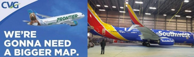
Are these the new liveries of Frontier and Southwest?
Today might go down as “Airline Livery Leak Day.” It appears that the new liveries of both Frontier and Southwest Airlines have leaked on the internet today, which shows that it is hard to hide things from social media.
Southwest Airlines has a media event set up at their headquarters for this Monday and Tuesday, where they have been promoting a big announcement. Similarly, Frontier Airlines has scheduled a media event for Tuesday morning, giving big hints of a livery update. But it appears that the big surprise for both might have been ruined.
The Frontier Airlines’ image shows an evolution of their livery with a retro “F,” but keeping the familiar animals on the tail. Whereas the Southwest livery maintains the same colors, but is more revolutionary in its design.
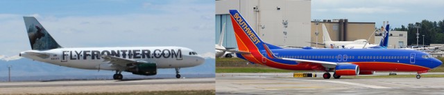
The current liveries of Frontier and Southwest – F9 Photo: Frontier – WN Photo: Bernie Leighton
AirlineReporter will be on scene at both media events to cover the official announcements. Our Mal Muir will be in Dallas with Southwest and Blaine Nickeson will be in Denver with Frontier. Be sure to get all the official details and images via our Twitter account as it happens.
My thoughts? As many of you probably know, I love following airline liveries and am not afraid to give my opinion. For Frontier, I was hoping for a bit more of a change. It looks like a clean design update, but why not use the opportunity to go bigger? I appreciate that the animal on the tail design will go down to the body of the plane instead of stopping at the fuselage.
As far as Southwest’s new livery — at first glance, I am not a fan. The design looks a bit cheap to me, but maybe that is what they were going for? It might take some time for the new livery to grow on me and I wouldn’t mind seeing some high-quality photos of the full livery before making a final judgement.
But what do you think? An improvement for both or a step backwards?
Folks, I like Frontier’s. Period. Fits them well.
I dislike Southwest’s. They should have stayed the same or just gone retro. For an airline like theirs – keep it simple to apply & maintain, muted for professionalism’s sake and that yellow is so bad on their airline. Plus having writing over the windows isn’t simple to apply & maintain. Southwest has a great brand, only Alaska Airlines in my view has it better.
BTW, I really would put American’s livery third.
Both new designs are far better than American’s horrid livery.
I rather love the silver, metallic livery overall. 😉
your taste explains why you can’t wrap your brain around such a beautiful livery.
Quite honestly, Southwest’s livery design looks like absolute garbage. For a company that uses its livery as its logo (not the other way around, like most other companies), their livery needs to be clean, recognizable, and somewhat professional. I see none of those elements in the leaked picture.
At the very least, they better have a drastic website redesign behind that livery. Because quite honestly, that new livery does not link itself to the Southwest brand at all.
Well, I would admit that the possible new Southwest livery does stand out…
David
WTH are you talking about… your false premise that it needs to look professional makes it sound like you’re one of the bean counter suits in corp headquarters. HEART MAN! you can’t have heart while looking professional (double palmface)
A few low-resolution images leak and suddenly everybody’s an expert on liveries and has an opinion you’d think they formed over a decade of consideration. My first reaction is to be grateful that it’s not another boring, uninspired, cheap Eurowhite livery. I think I like it but will withhold final judgment and tell I’ve seen it in person.
I love the new Frontier, Southwest not sure yet.
I LOVE the new Frontier look. The definition of how a livery should be updated. I don’t hate the new Southwest look, but can see why so many people will. I can’t wait to see both in person
Totally agreeing with gkflies. As a Southwest fan all of their liveries have had a bold spirit and culture that is recognizable and respected. This livery does not represent the southwest brand. I know today’s southwest is not the same airline as it’s past and this new visual image shows that this company is different and is losing it’s core values. They have always been a low cost carrier but with great service and class. This image just puts them as a ultra low cost carrier in the ranks of Spirit. So dissappointing.
If they were looking at a refresh they totally missed the mark. They needed something bold yet that mainintains their core values while representing the new southwest with the full integration of AirTran and the full repeal of the wright amendement. This does none of that. All this does is make them stand out like a sore thumb such as spirit. Where’s the heart symbol that represents the love?
Southwest’s is awful — those colors just don’t work — and with the new tail and the large print on the aircraft…seems an odd copy of American’s new livery. However, AA’s is pleasing color-wise while SW’s is not. Frontier’s seems like an odd change…they aren’t changing the tail…just the F in Frontier….seems pointless actually!
Well, the tail is a bit different. The animal design goes down into the fuselage with the new livery, which I think is a nice addition.
David
I guess I don’t get that Frontier is getting new livery at all. I figured when Southwest acquired Frontier their fleet would eventually be painted in Southwest colors. Maybe you can help me out with this one.
Frontier was not acquired by SWA.
Well, it is something new to look at every time i spot at SJC. I don’t like the livery however. This livery has potential and I think it could just use something on the tail, on the winglets, and not have the bottom half of the scimitar winglet be white. I never really liked Southwest and i was hoping this new livery would change my mind but it really didn’t. To me the new livery almost looks like the flybe livery.
Frontier taking their website off their planes is a great move. I like that Southwest eliminated the orange from their scheme. Southwest planes really pop with their bright colors.
I hope they both paint something on their bellies like Qatar does.
I disagree Erik, Southwest’s original scheme was calm (don’t want to excite folks too much for a no-frills alrline), professional (good for keeping frequent fliers), simple (important to be able to repair from scratching quickly away from a maintenance base), retro (I just like retro when done in context with history) and original (important to stand out) all in one livery. But I like you would want the N# & more on the belly.
The yellow on the Southwest scheme and the lettering over the windows both are what annoy me the most.
Frontier Airlines new scheme looks great.. Although it reminds me a little of Alitalia though.
Southwest Airlines new scheme…Reminds me of McDonald’s — Looks unhealthy, and cheap.
I’m extremely underwhelmed and not thrilled at all with this change at Southwest. That shade of yellow and the softened lines look downright cartoonish. The font on the fuselage too is just not appealing and does remind me of so many small, regional European carriers.
The Frontier change I’m okay with. I’m a fan of the “spokesanimals” so I’m happy they’re still along for the ride. They seem to be taking a page from Southwest’s last change and pay a small homage to the past. The font here looks bold and forward moving. Progressive.
Let’s hope this Southwest plane is just a repainted Shamu and nothing more. (Wishful thinking).
I think the Southwest scheme looks amazing. Instantly recognizable and bold. It will be really striking with 7 or 8 birds in a row at the terminal and will look great when seen from below (though I will miss the red belly). When I’m craning my neck to find the plane making that rumble on climb-out, and see it at 15k feet, I want to know what I’m looking at, and Southwest wants you to know too.
Frontier’s is handsome, but not very creative. Another white tube with writing, however it is an improvement on the very ’90s’ looking previous design.
Well it is go to see someone who likes the Southwest livery!
David
I think that the new frontier livery looks like an 90s paint job. I do like what they did with the tail, but not with what they did to the body. That part looks terrible. And with southwest, something is bothering me and I think it may be the colors. I think it needs to be more red and blue. No yellow or orange. They always talk about their “luv” so maybe a big heart on the tail would be kind of cool? I also don’t like the font of the text on the fuselage. That could have changed too.
I like them both.
I’m happy to see the current Frontier (1994) use original Frontier’s (1950-1986) “F” logo as part of their titles.
The Southwest livery, in my opinion, is a nice change, retro in some respect as it reminds me of an era pre-90’s when many airlines wanted to stand out and be identified.
Frontier’s looks well thought out, Southwest’s looks like something straight out of the Sunday comics. I can only imagine how hot those hulls are going to be with the darker paint scheme vs the lighter Frontier scheme. Poor choice.
Frontier – Like. It works for me.
SWA – Too much yellow, not enough orange. For me, it’s a southwestern color thing. Orange is the color of the western sky as the sun sets in the west, the color of the mesas in the golden hour and the color of the desert landscape under certain lighting conditions. Yellow is the color of McDonalds.
Frankly it was perfect, they should have left it alone. The current livery is easily spotted from the ground as the aircraft pass over at 12,000 ft, is tasteful, bright enough and not too obnoxious. The paint salesman sold them a bill of goods.
The yellow on the new southwest livery looks horrible. Should kept the orange color instead.
Southwest airlines new paint scheme looks like the Hot Dog On A Stick colors. The new flight crew uniforms are going to match the paint scheme. What a wrong way to go SWA. Your going to be the laughing stock of the airline business with that choice. Good way to spend money on a new look when you cant even negotiate a new contract for your 11 work groups currently under negotiations. You want to have cost neutral contracts while your spending millions to upgrade your image and make the stock look good.
Bring herb back,now!
The Southwest livery reminds me of the Arizona flag. I’ve never been a fan of the current scheme, but it’s better than the dusty yellow and orange Southwest had before.
The Southwest airlines looks terrible! it looks like a cartoon. It disgraces the history of the livery. Wish the would have painted them like the classic retro series with Gold red and orange like N711HK
Frontier’s is terrible. Melding 2 fonts, 2 logos…it’s just messy. I can only imagine its the result of too many people having an opinion. If you’re going retro, go full boar otherwise it doesn’t look thought out.
The southwest livery is a step in the right direction but not fully there. The colors and lines are much more active than the current design but combined with a rounded san-serif upper-lowercase makes it appear childish. Step in the right direction and hopefully the next iteration gets them there.
Also would have been nice if SW would have continued the lines along the lower part of the fuselage to mimic their current livery.
Is that a CG pic? I swear I am looking at the 737 Max wingtips.
Super glad to see the frontier expand their animals to the fuselage, restricted to the tail makes them seem cramped in comparison to the AC profile.
I think that both designs are a welcomed change, and I applaud Frontier for eliminating the “FlyFrontier.com” from the fuselage. I do like Southwest’s change, but only for updating a much needed livery. It has been my opinion that SWA should have been the winning bidder for Frontier, and that the new airline should have retained the name Frontier Airlines. After all, Southwest no longer serves only the southwest, haven’t for many years now.
At first I was not a fan of the SWA scheme. After 24 hours and looking at the current one, I LOVE it. You get that paint and put some Scimitars on it and BANG! One nice bird. I also like Frontiers. The Animal ID under the nose and the Saul Bass F look nice.
You got to be kidding people, the love swa has is for your money, the ugly paint scheme goes with the ugly company…
I like both of them, but Frontier’s looks cleaner. I expected it would be the opposite. It is funny that Frontier looks like it spent a lot more money on theirs even though they are transitioning to an ULCC. Meanwhile Southwest looks like it went the cheaper route while their avg ticket price is up 21% from last year, as if they are transferring out of their low cost carrier days. Let’s hope they have a loyal enough customer base to get them through this, I do not think this is a good start :/
Several comments I’ve read elsewhere have either said how SW’s blue-with-white logo looks like it should be Facebook Airlines, instead of SW, or, the VERY primary colors of the tail almost make it look like the Wonder Bread logo!
When the local Dallas media were previewing the “big announcement” from the other day, it was so amusing, as at least one of the reporters was in the Love Field terminal in front of SW’s ticket counter–which already had the new logo on it! For a day that was supposed to be a big surprise event, they messed it up by letting the cat out of the bag without concealing it first inside the terminal.
The Southwest livery is just horrible. Okay, it’s not white, but it’s also WAY too primary. “Wonder Bread” is right. It screams downmarket and LCC which WN hasn’t been for years. They have a couple funky things like cabin crew who spout a few spikey bits of dialog and the whole festival seating thing, but they’re not REALLY an LCC anymore. They say they are trying to appeal to the business traveler and that they get they need to start doing SOME sort of Int’l tie-ups for future growth, but then they pull something like this.
No livery will ever be as great as the late, great Hughes Airwest.
I miss TWA’s last paint job with the golden world along the side of the aircraft. It was beautiful!