AvGeeks loooooove liveries. An interesting livery is one of the main reasons we go planespotting – we head to the airport to see either a particular type of aircraft, or to see that aircraft wearing a special or unusual livery.
A lot of time, effort, deliberation, and money go into designing those liveries, both the special ones and the mainline designs. A new multi-part series takes a look at how those liveries are designed. Last time, we looked at Icelandair’s branding and livery refresh. Today, we’ll take a look at Northern Pacific Airways‘ mainline livery.
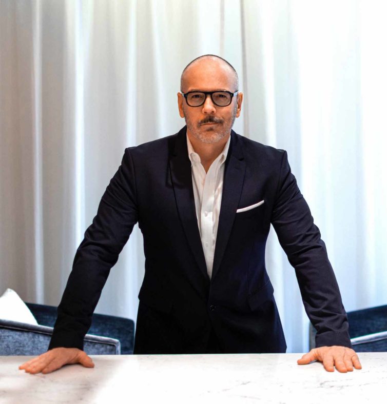
Edmond Huot, Northern Pacific Airways’ chief creative officer and airline designer, explained that “We were given a clean slate to design the livery, the collateral, and the name. I was given a lot of latitude, for sure, and that is the exception to the rule as projects typically come with a framework and the client might be more hands on.”
For the name of the new airline, Huot said he wanted a name that “had an inherent story to it, and I didn’t want a trendy name.”
“Northern was the first name we came up with, but the legal team came back and said we can’t do northern,” so the name eventually morphed into Northern Pacific Airways.
“The stress for me, in the world of airline design, is that you only get one or two kicks at the can, so I already knew up front we had to nail it – I did a lot of research into the factors that would influence the brand – people, regions, etc.
Naming projects are usually very tricky, and that’s when the pressure started. We actually came up with the idea on a plane flying back from a meeting with a different client.”
He continued that “The idea was to come up with a name that wasn’t typical of a LCC (low-cost carrier).”
Further, “You can’t pick a color that might be offensive to a particular group, so the motifs we ended up using were way more abstract. The colors are very Alaska – the white is for snow covered mountains, the sheer rock is the black, but it’s not just picturing Alaska, but how people in Asia perceive Alaska as being a wild, exotic location,” he said. “We mapped a path visually, North Pacific and Asian, creating a common symbiosis.”
After coming up with the brand, Huot then had to “parlay that into a livery.”
The next step was to determing how to position the brand so that it “links to the reality” of being an LCC, but makes “people want to feel as if there is a premium aspect to the service,” he said. “The aircraft needs to show that sort of premium presentation. There is a wide spectrum of graphic approach – a lot of liveries are driven by commerce,” he explained.
“I don’t think there’s any need to communicate cheap, like Spirit, who based that yellow livery on their fare – the CEO wanted people to feel like they were flying on an inexpensive plane because that was part of the pricing strategy, but we wanted to not diminish the style” of air travel, he said.
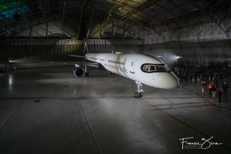
“I definitely believe that you can do something that looks and feels special without having to charge, and I am happy they chose the 757 because it’s an elegant looking plane; there are a lot of planes less flattering.”
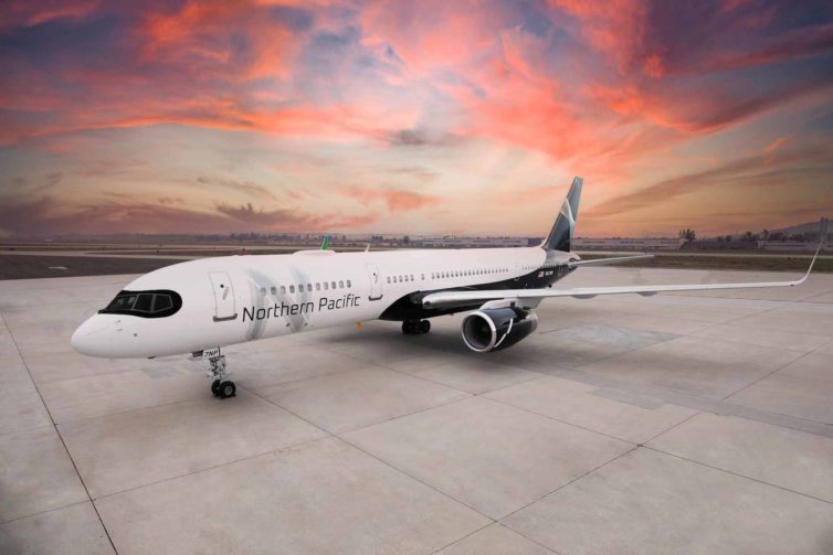
For the overall livery, Huot said he “looked at aspects of aircraft in general to be sure we were using graphic elements that accentuate length and form,” and wanted to use fewer colors, leading to the black, white, and grey of the chosen livery.
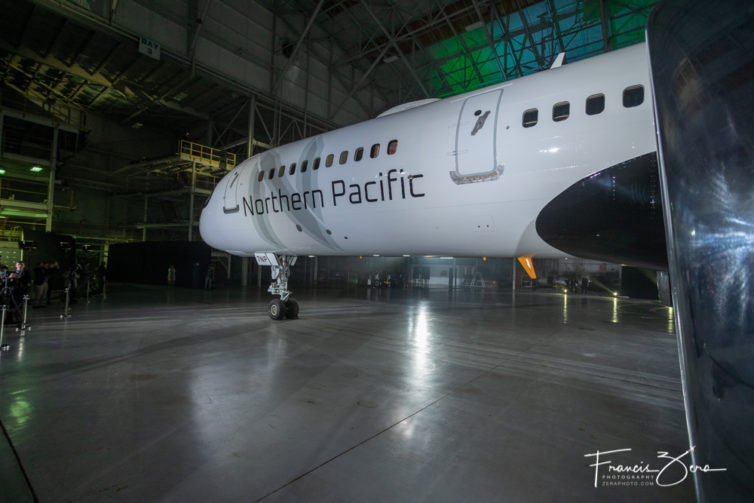
Northern Pacific’s livery colors were chosen to evoke the ruggedness of Alaska, the state in which the airline is based
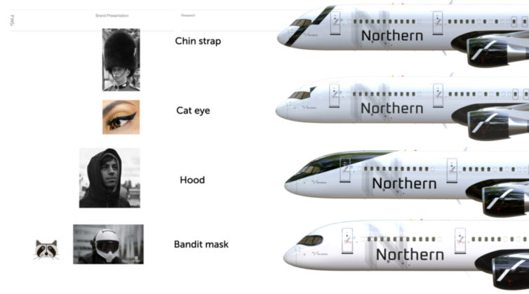
The “raccoon” mask surrounding the windshields was one of the options Huot presented to NPA leadership. “Generally, it’s an aesthetic decision – it can also mitigate reflection, but it’s been done in many forms, and, yes, this happens to look similar to the A350, he said.
“We wanted to inject some sort of charm factor, something distinctive, and we felt like the masking was the solution.” He presented five options for the front design element.
“One I called the hood – the rounded roof part was all black, one was called mascara – a little black triangle off corners, one was called chin strap – a black line under the bottom, and the mask was what was selected.”
He added that “part of the job was to modernize something that’s seen as an old aircraft, and the masking will translate nicely to other planes” should NPA add other types of aircraft to their fleet in the future.
“When I presented the livery, there was a unanimous acceptance of it,” he said.
“I think people are looking to return to something that feels special, and a beautiful livery that looks like something special,” he said. “This livery was really about doing something that had glamour to it.”
Which would you have picked?
Comments are closed here.
I really like the livery, but just not a fan of the mask. I think it makes it look too Airbus-like, and takes away at the very attractive 757 nose and cockpit window design. But all in all, a very nice looking livery!
I see the name and the railfan in me immediately thinks of Northern Pacific Railroad. Their livery was black and yellow for locomotives and a gorgeous two-toned green design by Raymond Lowey (designer of the executive branch aircraft livery in the US–Air force One, etc.). NP Railroad’s logo was the Monad–the “ying and yang” circle used by Korean air.