-
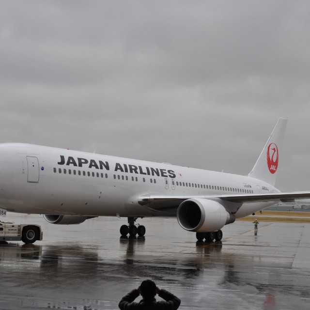
- The new JAL crane livery outside.
-
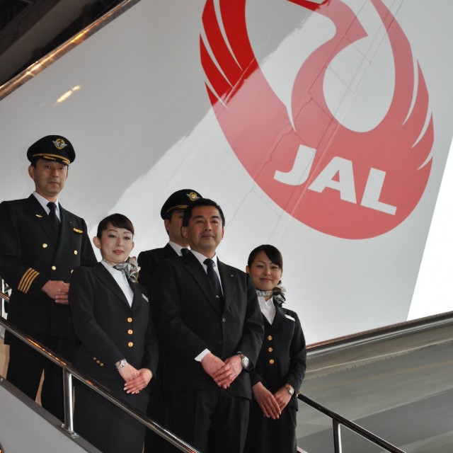
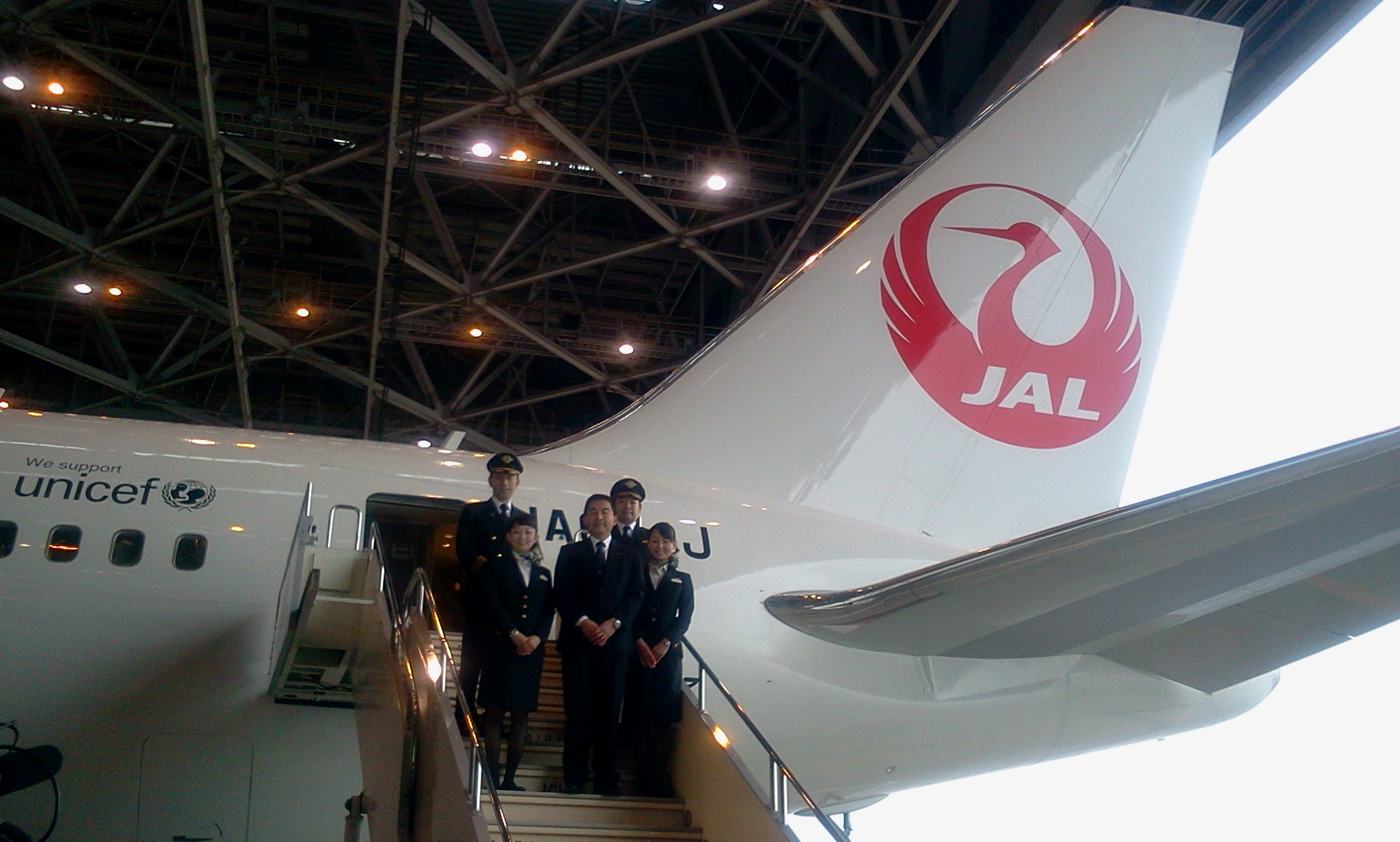
- New crane livery with JAL President and crew
-
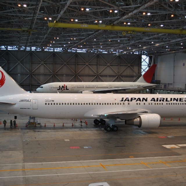
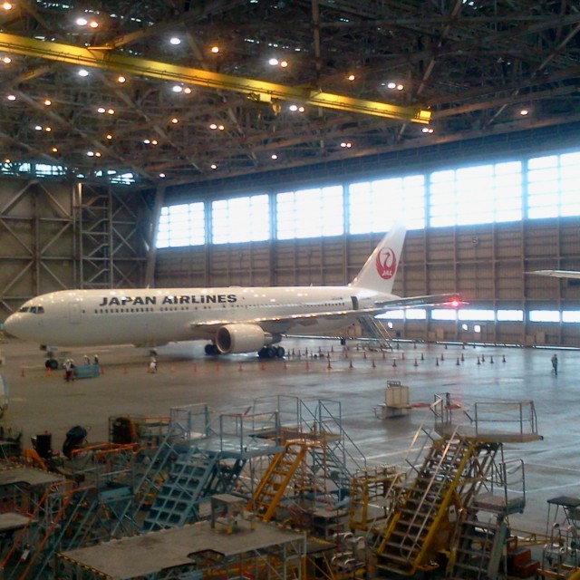
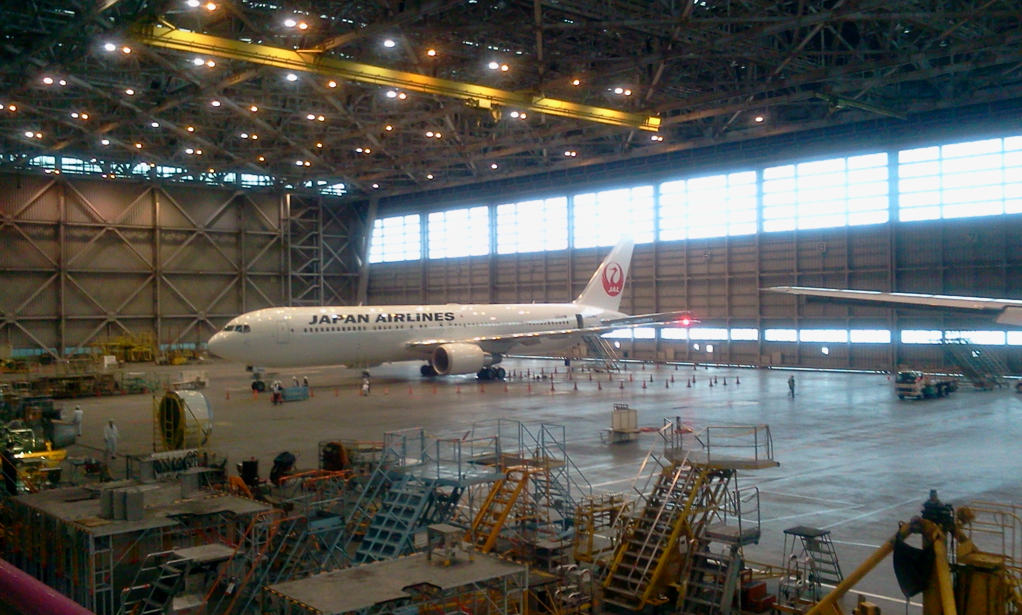
- A Boeing 777-200 (JA0090) sits in the hangar with the Boeing 767 (JA654J)
-
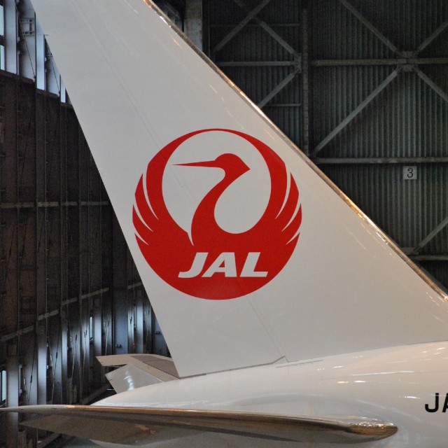
- Tail of Boeing 767-300ER with crane livery
-
- Japan Air Line’s new livery on a Boeing 767-300ER. Photo from JAL.
-
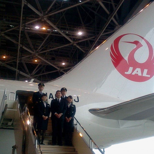
- Cabin crew check out the new Boeing 767 with crane livery.
Japan Air Lines (JAL) has officially unveiled their new crane livery on a Boeing 767-300ER (JA654J) in Tokyo. The plane was flown, unpainted, from Paine Field to JAL’s maintenance center in Tokyo where it was painted in the new livery. The resurrection of the crane is to match the airline’s, “new philosophy and corporate policy which underscore the company’s re-commitment to provide the highest levels of service to customers and to raise its corporate value in order to contribute to the advancement of society.”
The new aircraft will start flying between Haneda and Beijing on March 2, 2011. Before then, it will be flown on a domestic flight between Haneda and Kushiro where Japanese red crowned cranes hang out during the winter.
When I first got a glimpse of the computer generated livery I thought it looked much too plain. In photos I think it looks much better, clean and classy, which I think they are going for. In a time where airline liveries are getting more and more complicated, the simplicity of JALs new crane livery is a nice change. However, I think it is missing something. A swooping cheat-line would really make this livery look complete. What do you think?
Updated: Now sharing six photos, all from JAL.
Here are some other photos:
* Photo of the plane being towed on Airliners.net
* A mock up of the livery on a Boeing 787 Dreamliner
It really does need a cheat line, or at least something else. As the very front, and middle part between the name and and tail is just far too plain.
I think it is really plain. It needs a little something on the side to make it more complete.
I think it looks much better than it did on the computer sketch. I really like their last livery, though. Perhaps a fusion of the two,keep the front of the plane and repaint the tail.
It’s great to see the crane back in the sky but this livery is lacking, too bare. Perhaps if the JAPAN AIRLINES font was applied in billboard fashion that would be perfect.
I disagree with the sentiments above…I absolutely love the way it looks…killer livery.
Again, this shows that JAL simply doesn’t work.
Rather than living up to reality and restructure itself into a significantly leaner organization without the burden of pension deficits.
Most importantly, JAL employees still think that the government will nevertheless bail them out and as a result productivity suffered.
The Japanese government should privatize the carrier and then emulate private companies alike and adopt a “up-or-out” policy, which pushes JAL employees to improve their productivity.
Simply restoring 1970s livery doesn’t change anything other than reminding investors that JAL is living in the past, not learning from the past.
So sad, it looks like a temporary livery on a leased aircraft. That red tail was so nice.
This boring bland livery screams generic store brand Listerine! It’s horrible!
Here is a beautiful picture of JAL’s 787-8 in the livery that is being replaced: http://www.airliners.net/photo/Japan-Airlines–/Boeing-787-846-Dreamliner/1875764/L/
Shouldn’t they spend the money on maintaining staff and routes? The new ”pseudo-retro” livery is ok but it is not that critical. Unless they plan on doing the former UAL thing of having the fleet in multiple paint schemes, I cannot see that the new livery is worth the cost of repainting the fleet. JAL has seen some really bad times recently. I would prefer they spend any extra money on keeping good staff and a viable route network. A new livery seems like a waste of money. Although, it looks like it would be easy to paint over if they need to sell some aircraft. I hope they take your suggestion and add a cheat-line so all their jets do not look they are part of a wet leased. Unless they are?
It’s actually plainer than the previous livery or am I the only one seeing that? The crane is nice, but removing the red curve that goes across the ‘A’ in JAL in front of the plane and replacing it with an all back JAPAN AIRLINES lettering actually takes a lot from the colorfulness it somewhat had before.
When companies change their corporate identity, they often use words like “fresh” and “modern” as a justification. If anyone dared to use those words with this livery, you would have to question whether or not they lived on the same planet as the rest of us. After seeing the livery “in the flesh” at Tokyo Narita last week, I am simply shocked. The previous livery looks “designed” and shouts “quality”. This looks plain, ugly, boring and (as someone else wrote) like the temporary titles on a short-term lease aircraft.
If the crane was so important, it could have been incorporated into the existing livery. It’s also amusing/distressing that the design team thought it was OK to have JAL (three initials) within the logo but the titles on the fuselage are two words: Japan Airlines. I challenge Japan Airlines execs to put old and new alongside and get a panel of 300 people to vote for their favourite. I would place quite a large bet on the outcome being 80% plus in favour of the so-called “old” design.
Wow, I am shocked. I have often felt that when a company get into trouble, a sure sign that management is incompetent is when they resort to fiddling with the brand. It’s like the problems they face are insurmountable so they desperatly resort to something cheap and easy. This appears to be the very worst case example of this. Clearly this does not address Japan Airlines underlying problems. But it’s also backward looking. Rather than looking to a Japan Airlines in the future, it reminds us of Japan Airlines of long ago. Add to that the sheer boringness of the design. It’s the old crane logo with a white fuselage and black “Japan Airlines” lettering. It looks like an interim logo applied to a leased plane. There is nothing about this look for anyone to grow attached to. Now it looks simply like JAL just don’e have the budget to do anything but paint their planes white and them attach some simple decals.
I think I know why they have done this though – and its not a good sign. If they have to let go of planes as their fortunes dwindle, leasing them out will be very easy. The can pull off the decals and quickly have an all-white plane. This should make the planes very easy to send out on short term loans or to be parked in the desert without obvious signs of who the plane should be flying for. Essentially management are plaining for the airline’s fade out rather than resurgance.
I am excited to see the crane making its way back to sky again. However, I do agree with some of your comments about it being too plane. It looks very retro to me at the first sight. I am not sure if this the design intention behind. Judging from a higher level perspective, the idea was great to resurrect the crane. But the more thoughts could have been given to the execution part of it.