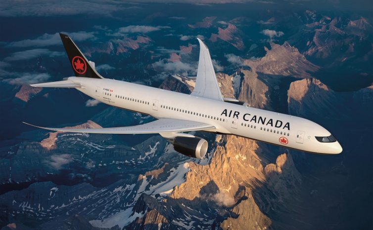
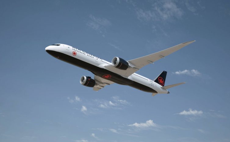
Have you ever thought that black was a color that represented Canada? – Image: Air Canada
NO!
Okay. There. I said what we were all thinking as Canadian AvGeeks. I just can’t. I am not a fan of Air Canada’s new look.
I want to understand the decisions behind this branding. Except, when I look at it I see nothing but bad things. “Inspired by Canada: Our brand new livery evokes the natural beauty and striking landscapes of our great nation #FlyTheFlag.”
Yeah, okay look. I am Canadian. I used to live in Canada’s subarctic. Black is a very common colo(u)r in Canada. Why? Because it’s freezing cold and dark for nine months of the year.
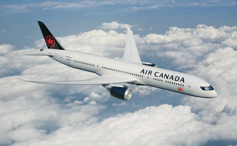
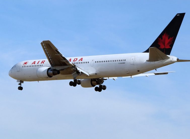
Why did you put the roundel under the windowline? – Image: Air Canada
Boy, that’s super inspiring and inviting. That’s how you put your country’s best face forward. “Canada: Cold, dark, and minimalist.
The red, then must be a tacit reference to an old Lewis Black bit about how he took a bus across Canada and by the end was cutting himself just to see some color! You know what else is black in Canada? The oil from the controversial tar sands! Boy, that’s just what Canadians want to be known for overseas.
I. I’m lost. Let’s read some more PR speak: “Reflecting Canada’s vastness and contrasting seasons, with references to its wildlife and First Nations heritage, the new fleet livery was designed by international design firm Winkcreative.”
Well, Winkcreative, I am sorry no one at Air Canada actually listened to you and you were left using your original concept to justify this…
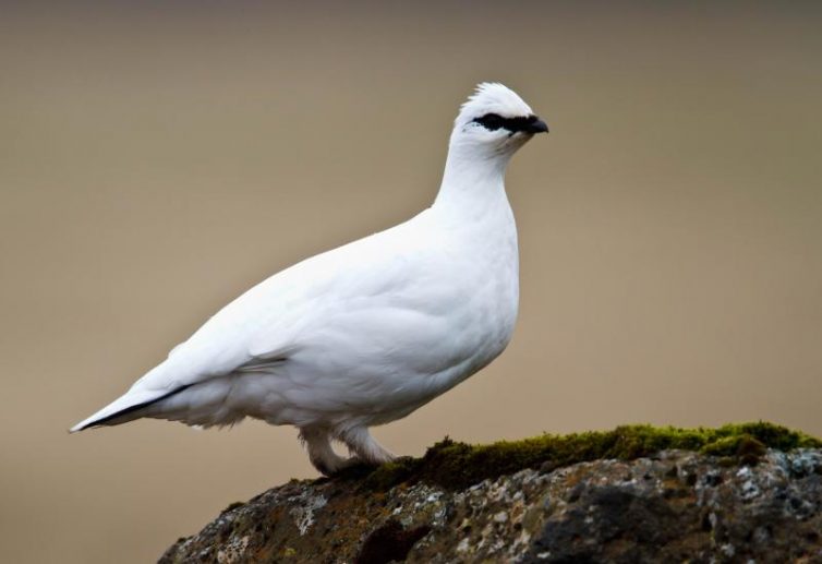
This is one of the coolest birds of the arctic. The ptarmigan. It has a black visor on its eyes – Photo: à“mar Runólfsson Flickr| CC
Wait, no, this is a Rock Ptarmigan.
This…
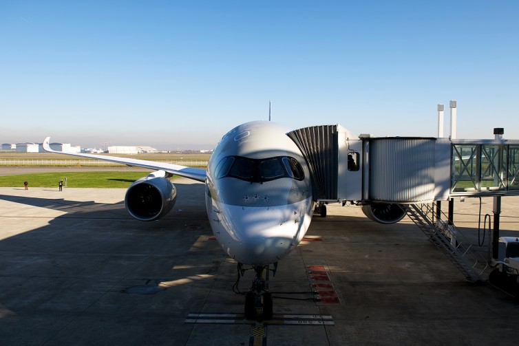
Qatar Airways’ First A350 (MSN006) at the Airbus Delivery Center – Photo: Bernie Leighton | AirlineReporter
Wait, no that’s an A350 where the black window outline looks impressive. Sorry Air Canada.
I meant this one:
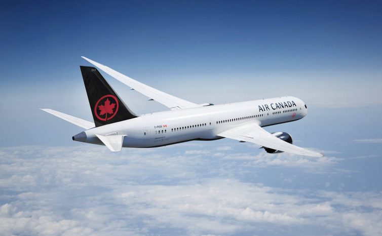
The Belly Branding, okay. Sure. But you can do that on any aircraft livery. – Image: Air Canada
Look at the first two pictures I selected to illustrate what a little eyeliner can do to a flying thing. Now go back to the Air Canada rendering.
It doesn’t look mean, classy, or futuristic. It looks ridiculously out of place. You know what this livery is? It’s the 1990s again!
This was the AC livery from 1993 to 2004 – Photo: Adrian Pingston (Public Domain)
No one actually wants it to be the 90s again in Canada. Worthless currency, surly Air Canada with a product lagging behind its peers. Cyclic bankruptcies in the airline business, protectionism, brain-drain. Does this mean Robert Milton be coming back as CEO?
I’ve seen this before, but it was nicer on Delta – Image: Air Canada
So, let’s see. Air Canada managed to take a livery that represents not the best part of their history, a period of economic ill-ease in Canada, and did one more thing to top it all off?
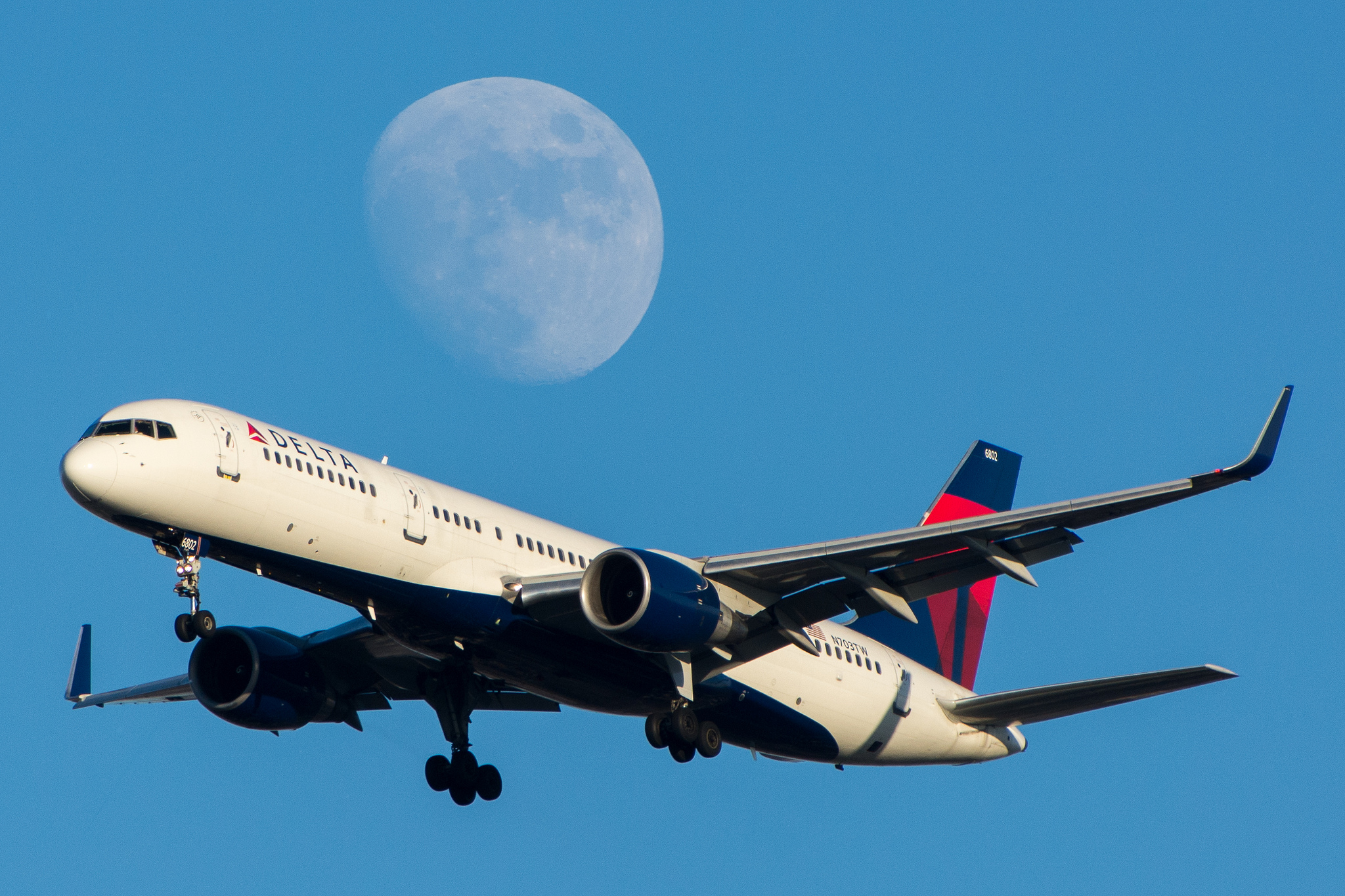
The Delta livery looks mighty familiar – Photo: Jason Rabinowitz
They blatantly ripped off Delta, and decided to add “raccoon eyes” on the flight deck windows to make it look more modern. Except, that only works on the A350.
I can’t be the only one with a visceral reaction to this livery. What do you all think? Am I way off here?
I disagree with everything that you have said.
I think that the new Air Canada look is sleek, elegant and will ultimately prove to be a long-standing livery. The black and white with a red roundel is something that I think is stunning. As for the paint treatment on the windscreen – it’s hardly a Delta ripoff. It is a unique way to draw attention to the aircraft and the very fact that we are even having this debate indicates that clearly, Air Canada has done something right. I think it was the right move and will prove to be as timeless as the BA Landor livery.
Agreed….!
Also….The black is evocative of the granite of the Rocky Mountains, the appearance of the Great Lakes right before a winter storm. The color of the sky before a Prairie thunder storm. To me, the black evokes many of the elements of Antoine de Saint-Exupry’s Wind, Sand and Stars.
I am a proud Canadian avgeek who isnt white and I love the article because it completely summarises the way I feel about this rebrand.
I can however explain the raccoon eyes: remember Winkcreative created the brand for Porter and what is their mascot?
[image: Inline images 1] Look familiar?
I agree with you, Bernie! I’m not Canadian, but as a friendly neighbor to the south who had a lovely trip to Canada late last year, black just does not say Canada to me. I would have liked to see a stronger focus on reds. I don’t think it’s a modern look, but rather one that’s already dated.
Our only point of disagreement is that I don’t think it’s a rip off of Delta. Delta’s design is super simple, but it works for them and I like it (although AA has the nicest livery, imo!).
Let’s all bear in mind for a moment that we’re coming off of an Air Canada livery whose primary colour was baby blue. I’ll agree for a moment that black isn’t a super ‘Canadian’ colour (in that it’s not really part of any of our major symbols), but neither is baby blue! Black, on the other hand, is always fashionable. And the black really makes the red roundel pop from the aircraft. If we look at the old livery, the roundel – so iconic an image of Air Canada – makes one appearance. In the new livery, it’s all over the place! I’ll grant that it does seem a bit Delta-ish to me, though. Anyways, love the new livery…just sayin’…
The thing about the Blue is that it was eye-catching and unique. You saw it and immediately knew it was AC. Also, ice-blue is a way better method of depicting Canada’s rather frosty heritage than… the darkness of the night.
Farewell ice blue, at least you live on as an option for Bentley Bentaygas. Alas, I cannot afford such a vehicle- so I will have to look at old photographs of AC to get my blue fix.
You hit the nail on the head.
The black/white/red scheme would be great for a Chinese airline, but it says nothing about Canada. The white/red is classic and perfect and far better without the black, even though to capture the essence and spirit of Canada you have options for several bright colors that could have been added, but that’s the point. Where’s the bright, vibrant livery?
Sorry man, I have to disagree with you on this one. It”s smart, clean, says ”leadership”, no clutter, First World. Reminds me of Delta”s. No clutter, not busy. Won”t need to be redesigned in 5 years. -HSW.
H.S. Wright III | Chairman & Founder Seattle Hospitality Group p: 206-674-3020 | f: 206-674-3023 http://www.shgllc.com
I hear your points, and acknowledge that I’m not Canadian, so this isn’t personal to me (though I love your country). That said, I really like the livery. I think it’s smart, distinctive, interesting, and appealing. (And I respectfully disagree that it looks a lot like the Delta livery.)
I agree with the author.
This was a remarkable opportunity for AC to really bring Canadian heritage to the forefront. They could’ve looked to Alaska Airlines or even Norwegian for inspiration. But instead the livery looks…calculated….Like something out of a focus group. Eithad did this well. Air Canada most definitely did not.
Your opinion pretty much nails what many others think of this new scheme. Just as the previous scheme’s ice blue scheme where the predominant colour is ice blue (= cold, unfeeling), the choice of BLACK is beyond belief. I ask myself if the airline ever used focus groups or invited ideas through social media before short listing the scheme. I have seen many improvements to the offical scheme since its release on Feb 09. The design bureau must be happy – I am sure the cheque for their effort (?) was worth a few dollars….
Boring, stale and out of touch. Just like their management teams.
My apologies to everyone who doesn’t follow Canadian politics but this livery reminds me of the previous Conservative government. Read into that what you may.
I fly out of YVR quite often and really liked the light blue look of Air Canada. Why in gods name would the go from that to terrible livery?
Definitely do not like it much. I’m not Canadian but have flown AC a few times. I always thought their ice blue scheme was one of the sharpest in the skies. Maybe it will grow on me like the AA livery did. Take care all.
A mediocre airline swaddled in protectionism and obsolete thinking.
Not surprised at design ineptitude.
Is there anything they do well?
Follow me on Twitter @lefoudubaron
Black eyeliner and back to the ’90s or early Aughts. Basically Air Canada stole Avril Lavigne’s look from the days of her Complicated album.
I personally think thiswas a smart move. They are trying to be elegant, sleek, timeless… classy. Move more towards a audrey hepburn look than a marilyn monroe look.
What we should be discussing is:
They really have been focussing on their customer service and hopefully soon will be showing their new uniforms.
If only their staff could be paid to reflect the times like their aircrafts will. This company leads with great benefits but when it comes to their employee wages they tend to fall short. If only they could have taken the money they spent on the brand and spent it towards their staff instead. Everyone knows if you treat your staff well, they treat your customers well and in return they treat you well.
The staff must love their thankless jobs, especially when ive watched them be yelled at, harrased with threats of lawsuits over seat changes, threats of lawsuits over weather delays, and still manage to try to keep a smile on their faces and be professionnal. They really should make more then what they are making. Most other airline employees make alot more.
Anywho, good job on the rebranding, very audrey hepburn of you but work on treating your staff better!
New livery, uninteresting. On question of customer service (!!) after years of YVR-HKG, in flight crews mediocre (get them their econ meals asap so we can disappear to our rest areas), gate agents usually approaching my old age, but pleasant and helpful. Always looking for alternatives across the Pacific now.
In my opinion, I just hate the way it looks. The ‘raccoon mask’ on the windows is way too thick and it just looks disgusting, and I admired that stunning baby blue livery Air Canada used to have, so much that when buying aircraft models, the first one I would look for is AC, but now, I wouldn’t buy an aircraft model of this even if someone paid me.
You have a lot of hatred for paint on an airplane. Yes it closely resembles two other liveries you noted, but wow, that was a long winded story and unnecessary rant. #itsjustpaint
Hey Kay,
Although I personally like the design more than Bernie, I disagree that it is just paint. Companies (from Coca Cola to Ford) spend millions of dollars on branding and there is a good reason why. Do people buy tickets just b/c of the livery (well, some do, but most don’t)?
The brand creates a culture, an awareness, and really a feeling about a company. I think it does matter!
David
My initial thought was that anything was better than the skim milk” look this livery will replace. How Air Canada ever chose that skin colour is beyond me although I read that Robert Milton wasn”t involved.
I have wondered if the tail”s new design would be visible after night falls – those up-lights don”t seem strong enough to do the job against the black background. As for the nose area, Tyler Brul is also the guy behind Porter”s graphics – is this a cleaned-up reference to the Porter raccoon? Overall I like the clarity of the design and the return to the roundel. Now if AC could just reverse five straight years of decline to 31st place in SkyTrax”s overall best airlines ratings. Designs and uniforms won”t help.
As a airline retiree I do a lot of plane watching in my free time out at Pearson. On any type of day, sunny or dull, the new red maple leaf rondelle does NOT show off against the black (unless you make it flourescent and perhaps with blinking red lights as outlines! ..like on the roof of the ACC). Back to the future like others have said – the 90s when the red leaf on dark green background often showed up as a bland black generic tail in the photos used when AC made the news – esp in newspapers it reproduced horribly bad!. They need to show off that leaf which could mean a larger white rondelle behind the red one – on the tail, on the belly and one the cowlings – btw they should have the rondelle on the cowlings facing outward from the plane, not inward… what passengers inside that can view the engines probably already know who they’re flying on!. .Overall very disappointed in the new look/branding, the previous look hopefully will take a long time to replace … will they ever learn? BTW watching planes at an average distance on does mistake Delta and Air Canada planes as being the same carrier … both black tails with the dark red highlights virtually indistinguishable , even at night with their tail lights on … no wonder the pilots more often than not choose not to have the plane watchers try to know who they are … we’d fail anyways!!
I am Canadian and I dont like the new look at all. The choice of using black color seems depressing. I’d hope a bit more red and white, like the colour on our Canadian flag. The current blue colour livery is nice too, don’t know why they want to change it.
Air Canada is an organization that continues to befuddle me. Not a week goes by that we don’t hear about cancelation or delay frustrations from passengers. Or lost baggage horror stories. Or, in some head scratching instances, how their spokespersons respond almost ruthlessly to passenger dilemmas.
Oh, and I hate the new livery.
#NotMyLeaf
I hate that I agree with you Bernie 😉
I have to agree with you man. I don’t even want to agree with myself anymore. It’s strange how a livery can make us all feel like this.
Air Canada would get a lot more of my attention if they had pledged to have no seat under 18 inches wide in long haul instead of waisting time and money on this superficial branding exercise.
Sorry, “wasting” of course….
I agree with you Bernie, I don’t like this livery, if they were going to change the nice blue, they should have incorporated more red instead of black.
I still think the light blue was the nicest Air Canada livery of them all, it has nothing on the orange and silver CP Air livery of the 70’s and 80’s though….
No, the Trans Canada livery with the maple leaf and speedbird was the best.
Follow me on Twitter @lefoudubaron
Not so much of a new livery, they’ve had this scheme of close to this back in the 80’s I think it was. If I recall correctly nobody likes it back then either.
I am a longtime and frequent AC customer. You nailed it, this “refresh” is very bland and disappointing…
I know not everyone agrees but I always liked the current light blue livery. Landing in Frankfurt on my way home, it is always nice to see these distinct planes sitting there (they really stand out), and the twinge of excitement to see the homeward plane. The new look is so boring and similar to so many other “eurowhite” liveries, it completely loses that distinctive look. Not impressed.
The new livery’s just bland, plain, boring, generic, and lazy. Where’s the creativity?
First, black generally works great to accentuate key details, but in that case, its use should be minimized. As a background colour it’s just boring. Especially so in this case because it consumes practically the entire surface of the tail and belly. It looks like a void is consuming the maple leaf. Perhaps Air Canada is foreshadowing impending doom that’s gradually consuming it? I get that it’s their logo, but at least the last two liveries featured a textured leaf on the tail, which gave it more appeal. Unfortunately, it looks like what happened was that they really wanted their logo on the tail, but their logo has a circle around a maple leaf. This caused the size of the leaf on the tail to shrink relative to the last two liveries and the black background, so now the tail has too much black when it should have more red (red has more pop).
But what if you missed the logo on the tail? Don’t worry! They also decided to place their logo under the first few windows near the front of the plane, and again on the engine covers. If you’re counting along, their logo appears seven times on the aircraft; three on each side, one on the bottom. But they really want everyone to know that this is an Air Canada plane, that’s why they used the highest contrast possible for their name: black text on a white background…you know, like on work documents. Nothing like the reminder of bureaucracy while on vacation.
What’s most interesting to me is how different it looks compared to the livery of its wholly-owned subsidiary: Air Canada Rouge. Rouge’s livery isn’t perfect, but it’s more visually appealing than the new AC livery. It definitely looks more Canadian as it’s entirely red and white (sorry, new AC livery, but black doesn’t remind me of the mountains; it reminds me of cesspools). The decision to have such different liveries is also interesting given that many airlines around the world choose to keep the livery of their subsidiaries as consistent with the parents’ liveries as possible with only one or two distinguishing characteristics. For example, Cathay Pacific recently updated its livery, but it was strategically done to coincide with its subsidiary’s (Dragonair, now Cathay Dragon) livery update. The only difference between the two liveries now is the colour. Even WestJet Encore has the same livery as WestJet. It’s just a good way to market and sell the entire airline’s offerings.
I don’t mind an update from the old livery, but this new one is just uninspired. It references a classic livery that was more visually appealing, it has too many appearances of its “Rondelle” logo making it look too self-important, and it’s too different from the sharper look of its subsidiary. Minimalism is now trendy; but it requires stripping away the unessential, and Air Canada did the opposite.
You know what I hate most about Air Canada? Their old planes! Those 767, A330, and A320! Some of which are over 28 years old! Horrible seats in them! They need to go ASAP!!
Totally agree. An airline with obsolete ideas flying antique airplanes with a government protecting them from serious competition.
Follow me on Twitter @lefoudubaron
Thanks for the insightful reply. For Air Canada, unless it’s a 787, 737 MAX, CS100/300, E-190, and Rouge new A321, I will avoid it altogether. And I also strongly dislike that AC decided not to run 787 flights out of Montreal, save for the YUL-Shanghai flight, and the lack of 787 flights out of YUL makes me feel that they are treating customers out of Montreal an inferior level of service compared to the Toronto customers that get a 787. And also I saw that the Calgary-Tokyo flight was operated by the horrible 767! That must be 11 hours of hell for those on that flight! And also some of the Rouge routes deserve mainline year-round service with a 787, especially YYZ/YUL-Athens, where the lack of year-round service there caused SkyGreece to be founded, which you probably knew what happened to them.
In short, please do avoid Air Canada’s 767 (including Rouge), A330, and A320. They are much too old and are inconsistent to the excellent quality of service I have seen on the AC 787. Those old aircraft are a disgrace to the country of Canada much more so than the new livery, and need to be retired ASAP.
government protection? AC is no longer a Crown corporation. It lives (or dies) by what investors on the TSX think of the airline’s performance.
So, the goverment’s ongoing protectionism of Air Canada is a product of the imagination?
Follow me on Twitter @lefoudubaron
Air Canada is still subject to the Air Canada public participation Act. While not a crown corp per say it will always be a Crony Corp.
Planes are expensive. Seriously do you know what anything actually costs? Do you really expect Air Canada to just pull billions of dollars of brand new equipment out of their butthole including parts and tooling just to suit your snooty tastes?
Get bent.
You seem to have imported an inappropriate tone to this forum where we share our enthusiasm without recourse to nastiness. I suggest you consider respecting our culture, or find another place to post insults.
Follow me on Twitter @lefoudubaron
Looks like he just came in to harass a few folks. Guessing not an AvGeek since we are much kinder… no matter what side of the border!
The new livery is very boring. I don’t like it. I really like the current “ice” livery and the tail of their rouge livery. I wish they had a way to marry those two elements in to the new livery somehow.
Sorry AC, red on black representing Canada? I only think of blunt force trauma. Maybe if they put some gray maple leafs (think current Team Canada hockey jerseys) on the black.
I’m not sure what AC is trying to do. They went from one of the best liveries to one of the worst.
While I think the new livery looks sleek and clean, it”s so generic. Betcha the AC committee browbeat the designers until they ended up with this. All they really achieved is paying a lot for minimal brand impact.
Well, did you forget something? This is supposed to be a flashback on the 80 years of AC and Canada 150.
I agree with Bernie. I liked the 1990s eurowhite livery that looked black but was supposedly green. The unique ice livery they currently have was unique and I enjoyed it.
The design firm definitely ripped off delta and put raccoon eyes and used black instead of blue. It’s the first thing I thought after seeing the unveiling. How can you not see it ?????
David P. Brings up a great point. Brand recognition does matter in my opinion. One thing is certain the livery is here and we have to get used to it. The tail is the best part for me and I get the red/black contrast.
The previous livery was gorgeous, but I guess they felt they needed the change. I think the new livery is OK, except for the black “mask” around the windshield. It breaks the smooth lines of the nose, especially on the new 787 and the future CSeries
Sorry, Bernie, but THIS Canuck disagrees. Somewhat disheartened that you let the PR bafflegab get to you, and you should know better. ALL of those words were conceived well AFTER the design was conceived.
From my POV, the soon(ish) to be replaced livery WAS cold, and this one projects assertiveness, cleanliness (of lines) and re-emphasizes BOTH the traditional maple leaf, and the Air Canada logo/branding.
Plus, if you put it into context with the new(er) interiors, there IS a continuity of design.
And, For What It’s Worth, being an old(ish), retired marketing person, it was time for a brand refresh, and likely repositioning. AS new a/c come into the fleet, and the livery spreads, the Air Canada brand will be easier to see, and appreciate as you sit in a lounge somewhere waiting to go, or come home.
I agree that the black mask is cartoonish, but I’m a HUGE fan of the black engine nacelles!
The black mask pays homage to Air Canada’s livery 1960’s Livery Go look at a photo of an old Air Canada DC8.
This livery is a really clever blend of all the previous Air Canada Liveries.
Excellent article!
I see Air Canada aircrafts in Seattle, San Diego or Paris all the time. In the gloomy winter times or bright summer days, the baby blue livery makes their aircraft stand out in an environment full of boring white, blue, and gray. It’s fresh and it’s original!
How many airliners out there are painted non white? Korean, KLM, Air Canada and S7 come to mind.
Honestly, this is another example of corporate identity faux pas. They spent all this money on a corporate identity refresh and completely miss the mark. You can say the same for Cathay Pacific or Transavia.
People at the HQ should get out of their cubicle once in a while!
I totally agree!!! It looks so old!
And they ruined the 787 beautiful design, that distinctive nose and cockpit windows.
Im a kiwi, take a look at our black birds.. actually i quite like the mascara look.. my experience is that airline livery redesigns and dont get me started on cabin crew uniforms seem to bring out a national cringe/rage etc.
I remember when looking at Americans latest for the first time I hated it. Now its grown on me.And Qantas streamlined the flying kangeroo,, removing its paws… Keep calm and go throw another kangeroo steak on the barbie. Air Canada can add stickers like air new zealand did with their Lord of the rings tourist campaign, I am not warm to ROUGE tho, too much lipstick and those cabin crew uniforns(who decides who gets to wear the hat on a flight?
WOW – What a mistake. Air Canada’s blue livery stood out in a uniquely clean, optimistic way.
Black is a reminder of the depression-era, it is a lack of colour steeped in evil – it is emissions, soot, and pollution and only looks classy and timeless when very carefully applied. A classic black tux, for example, when perfectly tailored combining both flat and silky stitching and details look amazing. But a cheap black monotone suit looks exactly what it is… cheap and bland – just like the black lettering on white Air Canada is now plastering on its planes. It is a metaphor for an old newspaper – bad news black headline type on white paper – and says absolutely nothing about Canada or modern digital times.
The livery looks like someone was paid to sabotage the Air Canada brand – to make it subservient. The mask around the cockpit looks like someone is hiding in a type of cloak and dagger mystery. I guess we’re now going to have black tray liners, instead of blue – and black uniforms instead of the much more classy current colour.
But the worst is probably lurking if Air Canada introduces anything Grey to try to complement the White, Red and Black – whether it be uniforms or otherwise. Grey is the ultimate bureaucratic government attire and given that Air Canada seems bent on destroying the brand, I’ll guess that we’ll see grey introduced in cabins and flight crew materials, since deep black is tough to keep clean. Deep blue would have been a much wiser choice if Air Canada’s marketing firm really felt it was necessary to abandon the instantly recognisable, differentiated current livery – I can imagine how they’re chucking now… the sold Air Canada on an expensive brand devaluation exercise and can look forward to the airline begging them to run more ads and redo the just redone website in stark Black & White to try to shore up sales.
well the food is very, so what”s the problem??
well the food is very grey, so what”s the problem??
To all the people asking for more red in their liveries: don’t fret… Rouge is there for you.
How do I get off of this endlessly tiresome exchange of comments and get back to your travel ventures.? Did I sign up for something new…? 😉
Reply with the word unsubscribe as explained on the bottom of all of these emails.
Follow me on Twitter @lefoudubaron
I really like this livery update. The old light blue was terrible – one of the worst in North America (maybe United is worse???).
If you look on the Winkreative website, it mentions that the livery “helps to reassert the airline’s position as its nation’s flag carrier”. For me, the livery evokes a desire to fly WestJet more!
The new (well, not so much any more by now) livery is ok. What I really dislike about it is the black cockpit windows eyeliner, visor or whatever you want tocall it. They should have skipped this entirely. For me, it turns the elegant idea into something creepy.
Totally disagree, it’s an iconic livery in the making in my opinion. It will no doubt become a classic. The stark contrast of the red and black reminds of the iconic CN rail locomotive. It’s bold statement vs it’s subtle washed out predecessor. The previous livery was bland in my opinion, especially the tail fin with it’s natural maple leaf confusingly contrasted against a modern geometric pattern. The return of the iconic Air Canada logo is definitely a plus in my opinion.
Moving from the 90’s white body/black tail with the dark maple leaf to the pale blue body/flecked green tail with dark maple leaf was a little startling at first for me, but after awhile I loved the look – Air Canada stood out against the standard Euro-white liveries of almost any other operator, and maintaining the distinctly Canadian leaf image was a no-brainer…. until they lost their minds. Why return to the old style, with added raccoon eyes? I don’t understand!….. but since I’m not Canadian, I guess it’s not my place to comment…
Funny thing about the “Delta rip-off” comments – I laughed when AA unveiled their new logo, with the distinctive stylized US flag tail – which to me looked very much like a version of CUBANA!!!
LOL
They should’ve made it look more racoon like, with wings, painting the fuselage forest green, and randomly have fruits and vegetables on parts of the fuselage to symbolize how racoons in Ontario are smarter at opening compost boxes than any other part of Canada. Since they don’t have a clue as to how to paint it to look good for the last 15yrs. Toothpaste anyone?