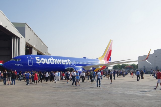
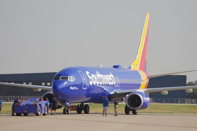
The first Boeing 737 (Heart One – N8642E) in Southwest’s new livery – Photo: Mal Muir
On a sunny Texas Monday morning, Southwest gathered hundreds of its employees, along with media from all over the country, to reveal a mystery that had been partially hinted at in previous days. Hints, rumors, and gossip pointed to a new livery and new branding, with huge feedback from not only passengers but Southwest staff wanting to make their feelings known.
But as everyone gathered in the hangar, it was almost a party-like atmosphere. CEO Gary Kelly got into the spirit and was among the staff, greeting folks and posing for photos.
More than just the planes are being updated – Photo: Mal Muir
When Kelly took the stage, he told the crowd how proud they should be. The airline employees have worked hard over the last 12 months for this special moment. “The one constant thing in the company is heart,” he said.
This gave a giant hint into what was to come. As the lights went down, a video played showing a transformation. The old livery shed its skin to a blank canvas. The new heart branding then slowly appeared onto the 737 on screen. Soon after, the doors opened, and there was the 737 in a new livery was waiting outside.
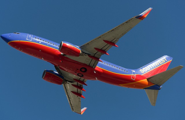
The second 737 in new livery (Heart Two – N8645A) arrives to Dallas – Photo: Mal Muir
The first aircraft to be repainted bares the name “Heart One”. The aircraft has a striking new paint scheme that has an underlying story to it.
It isn’t just the livery that is changing; it’s the whole branding. Gone are the red bellies of the aircraft; it is now mainly a blue aircraft with some bright colors given to the tail. Gone is the Southwest name on the tail, as well, for the first time since the airline’s inception. Moved to the body, the name now uses a new custom font (called Southwest Sans) and is striking in bold white. The name also makes it to the engine cowlings, promoting the Southwest.com website.
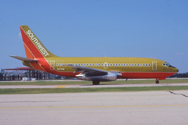
Southwest’s first livery as seen on this 737-200 – Photo: Aero Icarus | Flickr CC
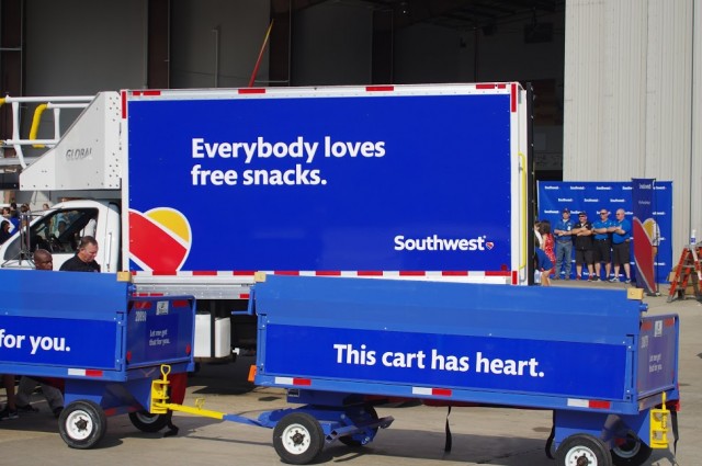
So why the new livery? Southwest executives across the board kept hammering the point that it wasn’t just the livery but all branding is changing. Planes, airports, uniforms, logos, websites. Even the onboard items, down to that bag of peanuts or pretzels. All of it was going to change, eventually. However, the process to change is not going to be a quick one.
The repainting of the fleet is expected to take seven years, and airport changes will take about three. These changes take money, and the fact was stressed that the airline is sticking to its mantra that they are the low-fare airline. To keep the changes cost-neutral, they want to update their brand as things need to be changed naturally and not rush it.
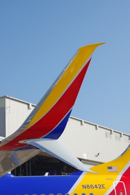
A close up of the Scimitar Winglet in new livery – Photo: Mal Muir
Southwest stopped repainting aircraft in February to accommodate this, sacrificing costs elsewhere to make changes later. The Southwest website was due to have changed this year anyway.
One thing that came across with the day was how passionate the Southwest staff can be.
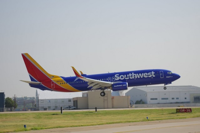
As the new aircraft was on the ground, “Heart Two” was coming in for a fly-by. The 2nd aircraft to sport the livery, it was being flown in from Spokane where it was painted. It was also the aircraft that had been photographed on Saturday night prior to the unveiling. Surely, that Saturday night would have seen people panicking at Southwest HQ.
The familiar red bellies of the last Southwest livery will be missed – Photo: Bernie Leighton
Chief Commercial Officer Bob Jordan had quite a bit to say about the changes. He talked about how the heart is now the symbol of Southwest — it signifies what Southwest is all about. Even Kelly stated that he wants the airline to be the most loved in the world.
They stated that the new look is not a “re-branding”, as many feel that the term re-branding says negative things, and is generally used to put away negative thoughts. However, this time the changes are meant to bring a unified look to the company. One look that pays tribute to the past, but also brings the future of the airline to the forefront — they want to stand out and be different.
Heart Two sitting in the distance – Photo: Mal Muir
Looking around on the ramp at Love Field with all the employees getting to spend time taking photos with Heart One, it was evident that it was true what they were saying that day. The look of the aircraft is always going to be a big deal, not only to employees but also the customers.
People get attached to the look and change is hard, but I glanced around seeing the LUV that was being thrown about. People were taking photos and selfies, saying how much it means to them.
Jordan said later that morning that the only airline that could paint a heart on a plane and make it authentic was Southwest. I think he’s right.
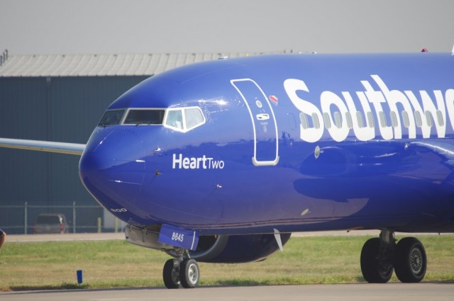
A close up of Heart Two’s nose in new livery – Photo: Mal Muir
When the livery was first released Saturday night, I know that many weren’t fans, but I liked it. To me it looked good, it looked striking, it stood out and it certainly gave an impression. Then as I saw it up close and personal, it drove home my original thoughts.
The staff at Southwest said that they wanted a livery that still screamed Southwest. Something you could instantly look at and think “Gee, that is Southwest”. I think they still have that with this livery. I think they actually have it greater than the “Red Belly, Canyon Blue” livery. When I saw Heart Two off in the distance today as it came around for its second approach, the big white lettering against the blue body stood out. I could instantly point out and say “there she is”. To me it is a big win.
Comments are closed here.
I’m with you Mal – I like the new look a lot, I like the new font (the old font is very ’70s). Love the way it looks on the winglet
LUV!
BEAUTIFUL