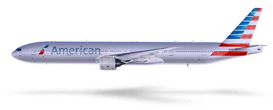
American Airlines new livery shown on a Boeing 777-300ER. Image from American.
From American’s Press Release:
FORT WORTH, Texas, Jan. 17, 2013 — It’s a new year and a fresh new look for American Airlines as the company today unveils a new logo and exterior for its planes, including the already delivered Flagship Boeing 777-300ER aircraft set to fly on Jan. 31. In addition, American plans to continue taking delivery of new planes this year as part of its historic orders for 550 new aircraft. The unveiling of the new logo and livery is the latest step forward in American’s ongoing journey toward building a more modern travel experience for its customers.
“Since placing our landmark aircraft order in July of 2011, we’ve been building anticipation toward a moment in time when the outside of our aircraft reflects the progress we’ve made to modernize our airline on the inside,” said Tom Horton, American’s Chairman and CEO. “While we complete the evaluation of whether a merger can build on American’s strengths, we remain steadfast in each step we take to renew our airline, a step we take with great respect for our name American. Today marks important progress in that journey as we unveil a new and updated look for the first time in more than 40 years.”
American is preparing to take delivery of hundreds of new, lighter aircraft featuring composite materials that must be painted. Since the polished metal look was no longer an option, the importance of the paint selection became critical to honoring American’s silver bird legacy. Silver mica paint was chosen as a way to maintain the silver heritage which American’s people and customers are passionate about, yet progress ahead with a clean new look.
American’s new logo.
“Our new logo and livery are designed to reflect the passion for progress and the soaring spirit, which is uniquely American,” said Virasb Vahidi, American’s Chief Commercial Officer. “Our core colors — red, white and blue — have been updated to reflect a more vibrant and welcoming spirit. The new tail, with stripes flying proudly, is a bold reflection of American’s origin and name. And our new flight symbol, an updated eagle, incorporates the many icons that people have come to associate with American, including the ‘A’ and the star.”
Since entering the restructuring process, American has made a series of strategic investments designed to place customers at the center of all it does and give employees the tools, training and leading technologies they need to provide customers with a uniquely American experience, while also creating growth and opportunity for its people.
Today’s news is a reminder that while there are still significant decisions that need to be made about the future of the company, American remains focused on continuing the forward movement of the many investments that have been announced in the past year, including:
- Industry’s Most Modern Fleet: This year, American will take delivery of nearly 60 new aircraft, including the new Boeing 777-300ER which will enter into service on Jan. 31. In July, American will begin taking delivery of Airbus aircraft made of lighter, more fuel efficient composite materials, which must be painted. The airline continues investments to offer state-of-the-art inflight Wi-Fi, in-seat entertainment, universal AC power outlets at every seat, and Main Cabin Extra seating on all mainline aircraft. In addition, American has plans to offer fully lie-flat premium class seats on all of the airline’s widebody aircraft and transcontinental fleet.
- Expanded International Service: American strengthens its network this year with expanded service to more destinations worldwide, including more international and domestic routes from Dallas/Fort Worth, more European and domestic service from Chicago O’Hare, new service to Europe from New York, and new service from Miami to Latin America and the Caribbean. This year, American also will begin the following international services: Dallas/Fort Worth ─ Seoul, South Korea; Dallas/Fort Worth ─ Lima, Peru; Dallas/Fort Worth ’“ Bogota, Colombia; Chicago O’Hare ─ Dusseldorf, Germany; New York JFK ─ Dublin, Ireland; Miami ’“ Pointe-a-Pitre, Guadeloupe; Miami ’“ Fort-de-France, Martinique; Miami ’“ Curitiba, Brazil; and Miami ’“ Porto Alegre, Brazil.
- Information in an Instant: The airline announced plans to supply flight attendants, pilots, and maintenance workers with their own tablet devices, designed to give them real-time information and better operational insights to do their job more efficiently. Beginning next month, employees will also be equipped with new technologies at the airport designed to make the travel experience easier and more convenient.
- Top-Notch Onboard Experience: Earlier this month, the airline rolled out new enhancements in premium class cabins on international routes, including elegant new china, more menu choices, and a more personalized service similar to a restaurant. In addition, American will expand the availability of Samsung Galaxy tablets for entertainment use in the premium cabins to more routes later this year.
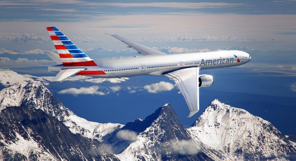
New American Airlines livery in flight. Image from American.
American Eagle and the AAdvantage® program also will get a new look as of today. The first American Eagle plane will fly the new livery beginning in February. Updating the new look across American’s network is a long process and will be rolled out over time to the airline’s airports, interiors and exteriors of aircraft, new uniforms, products and services, and technology platforms like AA.com and the American mobile apps.
American’s new look was created with input from our customers and our people, and in partnership with FutureBrand ’“ a leading global brand consultancy. In addition, American today launches a new advertising campaign designed to showcase the new look. The advertising campaign was developed with agency partner McCann Worldgroup. (end of press release)
The above video shows what an airport full of new liveried American jets might look like. And this video shows the historical perspective of the airline.
Currently there is a Boeing 737-800 in new colors (waiting on photos) in Dallas. American Airlines pointed out to AirlineReporter.com, “the planes are not, and will not be, painted white. The paint covering the fuselage, as you’ve seen, is a silver mica that pays direct homage to the now-former aluminum.”
SO — WHAT DO YOU THINK?!
 |
This story written by…David Parker Brown, Editor & Founder.
David started AirlineReporter.com in the summer of 2008, but has had a passion for aviation since he was a kid. Born and raised in the Seattle area (where he is currently based) has surely had an influence and he couldn’t imagine living anywhere else in the world. |
Comments are closed here.
I hate it. The font? Bland, boring, pedestrian. The livery? Incredibly on the nose. Not classy, elegant, or stylish. It’s as if they brought in Ted Nugent and said “We want the feel to be: ‘America, F*uck Yeah!'”. What an abomination of a… design-by-committee. “Could we have the icons in cornflower blue?”
Agreed! It looks like the jingoistic crayon scribblings of a kindergarten student told to draw a plane for the Fourth of July.
Could not be worse! Most of the amateur designs on the net are 100x better. Logo is average by itself. Tail design is a mess–looks like an art project of a first grade class. What a wasted opportunity.
I actually appreciate the fuselage and logo. The tail is evocative of Cubana. I am withholding judgement until I see in person, but am sure the tail will grow on me.
I like the logo and new font but the tail is way overstated and slightly obnoxious.
First impression… I don’t like it. The new ‘Eagle’ logo is unrecognisable, the name is OK but could do with being brighter and bolder and the tail is just awful. Shouldn’t there be at least a few representative stars on the blue bits?
Simply dreadful!
Argee with Jeff, and couldn’t they have kept a cheatline somehow? Quite a bit of a letdown.
Bugly.
yikes, it’s terrible. this would have been so much smarter: http://www.fastcodesign.com/1670588/a-hyper-cool-and-controversial-rebranding-for-american-airlines#1
It seems very unbalanced visually, the tail dominates. ‘American’ needs to pop a little bit more. A gray on gray doesn’t cut it. Extremely bland and boring on the fuselage.
Wow… Unlike mots of you, i’ce always disliked the American livery, but this is definitely a step backwards. It’s as if they just asked the designers “just make it a bland, unoriginal and ugly American flag”. The tail is overpowering and dreadful , the new font is barely legible because its gray on gray, and the new eagle logo is simply repulsive. possibly one of the worst liveries in the world.
*Lots
*I’ve
Sorry for spelling, the iPad autocorrect is horrible
Sam – you took the words right out of my mouth.
Not bad but I expected more color. Not really sure its enough to save American, they need to really stand out.
I actually like it a lot. I’m a bit patriotic and I appreciate the flag on the tail. I also like the new logo. I’m not sure how well they work together, but overall it has grown on me since I first saw it and I will be happy to get my first ride on the new livery.
No one asked me, but I have to admit, I don’t like it much at all!
The eagle image is confusing looking and the blue isn’t even on the American flag. Whatever, I hope the older planes still keep the polished aluminum without painting the entire plane to give the new look. I DO still like the polished aluminum more than any painted plane.
The equal amounts of blue, red, and white on the logo make it look French. Now I want escargot….
After forty-something years, THIS is what they come up with? Why would any major airline paint their entire fleet to look like temporarily leased aircraft?
Clearly, American Airlines should have looked to the distant past for their inspiration, because if this is any indication, that is the only direction they can look to with pride.
it sure looks terrible in the pictures, hopefully better in person. might be the worst livery in the industry now.
The B737-800 definitely looks better than the long fuselage of the B777-300ER (too much ‘silver’!!). Theres a B737-800 shot on Jetphotos.net taken at DFW today (N708NN)… it’s at
http://www.jetphotos.net/viewphoto.php?id=7541329
Correction… slip of the fingers… it N908NN
Definitely a massive improvement, but as a brand designer and an Art & Creative Director, my opinion is that they fell somewhat short of greatness.
They missed an opportunity to take this concept further. It needs to be fatter, for one. It needs to be more organic and curvy. It looks so rigid and stiff. I get that they were trying to simulate the tail of a plane, but the tail of a plane is FATTER. It doesn’t only have a thin edge.
Plus, the best logos that try to resemble a component of their trade in some way are IMPLIED. The logo doesn’t have to be a engineering rendering of the tail.
Fatter, curvier, a bit more organic (in the not so rigid sense) and it could have been so amazing.
Great effort but I’m disappointed an confused at why they had such a great concept but crap execution of implementing that concept.
CONCEPT: A-
IMPLEMENTATION/EXECUTION: C-
My credentials: http://www.behance.net/heliuscreative
LAME, The new Logo is a good impression, when it comes to the tail its sooooo UGLY. WHY would you copy the airline of a rival towards the United States. This gives me the impression that you are in connection with Cuba and did not even manage to come up with something new. United and Delta Airlines tails look more impressive that this junk. Just by the looks of a plane, i cal say that I might just consider staying loyal to Delta or United while leaving American in the pass. Overall in a scale from 1 to 10 I give the whole entire thing a 4.5! That’s in a good day.By the way, how will AMERICAN EAGLE look like?
I like it. I like the retro look. It’s very minimalist and the colors are very bright, bold, and blunt.
Love it. I was so tired of the tarnished/rusty metal and roller applied stripes.
The eagle logo reminds one of a Greyhound bus. The tail should have the logo, not the fuselage. The flag like design is a mess and doesnt belong.
Simply horrid!
I think the new wordmark is good, but the tail is so ugly. I was never a fan of American’s old livery, but that looks awesome in comparison now.
Disappointed, Some of the ones on the web are better. The new logo is hard to make out while the old eagle was easily recognizable. The tail goes a little overboard and the font is just bland. Although I think we will get used to it
Looks slightly better on the 737 http://www.jetphotos.net/viewphoto.php?id=7541329
The American flag feels misplaced as its on the tail
Hey, it is not an American flag on the tail. Our flag has seven red strips, not six as AA is using….. another reason not to fly with them as if they can’t get our flag right, what else have they screwed up on the airplane?
The swoosh thing (a la Air France) with Eagle only redemptive feature I can see here. That cold have been stylized on the tail (like Alaska Air) and really went POW. This looks like a prep for merger with USAir!!! I agree – have to really see this over time combined with the other elements of change overall.
Bad, Bad, Bad – whats with the red, white, and blue piano keys on the tail ? Cross between, air france, colgan, air, Cubana and Aeroflot. Cant get any worse.
The outside doesn’t matter when the inside of the planes are where the real problems are. Filthy bathrooms, LESS room in coach and old planes. Until they fix the parts customers see and experience inside the plane, this is nothing more than lipstick on a pig.
Hes reading lines
I really like this new identity. Nothing Eurowhite, as what more airlines are turning to these days, and embracing the silver of the old colors. Very modern and patriotic.
I hope to be able to see one in person before the end of the year…
I like it but what I really like is that they had the guts to break with convention and simply give their old logo once over. For the better part of the last few decades delta has had a delta, united had a U (call it a “tulip if you want) and continental had a circle/globe. And now united has a globe/circle. 🙁
Looks like a cheap LCC from Liberia. Ugly, trashy, and aesthetically something that would appeal to a gun salesman for the NRA.
I think that if they had just stopped at the tail and not painted onto the fuselage, I would like this livery a lot more. The tail just looks too busy.
Like cubana logo
Horrible! The tail is awful – just a busy mess. AA really had a great opportunity here, and they just blew it. The new design does not even look like it was put together by pro! Can you imagine a terminal full of vertical stabilizers, parked together, painted in the new logo?!?!? Cubana/ Greyhound – is that where the inspiration came from? Just a disaster.
At first I disliked the new livery. But then one thing slightly shifted my focus. With this new tail livery American becomes an almost true flag carrier at least in design (after Delta foolishly abandoned its superb wavy gravy tail design). I know that there are no flag carriers proper in the USA. But this new livery makes American feel and look like one.
Terrible. The tail colors should have either extended all the way around the aft of the fuselage (they didn’t do that because of having that part of the aircraft gets a lot of road rash and repainting all those colors would have been time consuming and expensive) or stopped the flag portion at the bottom on the vertical stab. It always amazes me how much money an airline will crap away on a paint scheme when they are in bankruptcy protection.
It does look like a cross between Air France and Cubana de Aviacion!
As a former AA mchanic, I was skepical at first. A somewhat obnoxious tail has been my biggest complaint. It has started o grow on me
One airline in the USA that is proud to be American (with the traditional red, white & blue colours). I truly applaud the airline for this.
Took me a white to “see” the eagle. Simply looks like a sticker that detached.
Fuselage color and front logo is nice, although too rigid and not organic enough.
The tail is just HORRIBLE. as others have written, a mix of cubana, aeroflot, etc… Why didnt they keep it simple?
The chose a tacky, visually confusing, and yes, obnoxious design. An overstatement.
Elegance resides in simplicity, gentlemen.
Example? Qantas, Swiss, Air France….
AAbsolutely hideous. I don’t know when I’ve seen a tAAckier paint job on an airplane.
Sorry if this has been mentioned, but this really looks like a Greyhound Bus Logo. Google it and compare to some of their numerous styles over the years….Breaking news, not a USAir merger but a Greyhound merger…Admit it, the synergy in logos is there…..
Well, the tail is just a variation of British Airways, Air France, Bank of America, Greyhound. They’re running out of ways to make those colors work, or to look distinctive in any way. Where are Braniff’s Flying Colors when we need them?
I much prefer inrtmfaoive articles like this to that high brow literature.
The tail is just a variation of British Airways, Air France, Bank of America, Greyhound. They’re running out of ways to make those colors work, or to look distinctive in any way. Where are Braniff’s Flying Colors when we need them?
This may sound odd, but WHY all the redesign if AMR are going to marge with US Airways? What will be the branding under the new company?
Terrible, one of the worst liveries in the planet ,looks like an old communist airline like Aeroflot and Cubana de Aviacion , very old concept.
American lost originality. Remember Braniff international?(from Texas) ,that’s creativity in every details.
Well, it’s not THAT bad (that is, compared to other airlines). But I hate to think how much American paid some ‘graphic artist’ to come up with that when you can find better ideas on many of the various FSX forums around the net.
You knew American would stay with bare metal. Personally, I would have incorporated the nostalgic American Airlines logo into the scheme.
I LIKE THE ATTRACTIVE NEW PAINT SCHEME, SHOULD SAVE A LOT OF FUEL AND
BETTER CRUISE ECONOMY (LESS-PAINT-WEIGHT)
I am a American Airlines Advantage member as well as credit union. My family worked for AA till they retired. I for one like change. I regret to say my personal opinion of the new eagle logo is extremely disappointing. The tails on the jets are ok but nothing to get excited about. I believe it would be a waste of time money and paint to do anymore aircraft this way. Something new would be just fine but this current design is not it. Seems to be an attempt to do better but fails miserably. I don’t know what other people think but I don’t appear to be alone. It seems most people don’t care for the new design. Even on my new credit card…….it is just plain ugly. Grey color background with a hap hazard little attempt to look like the majestic eagle we all know.Hmmm? Sorry but this one needs to go back to the drawing board. In all due respect. It stinks. This new graphic design fails. Sorry!