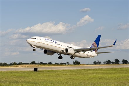
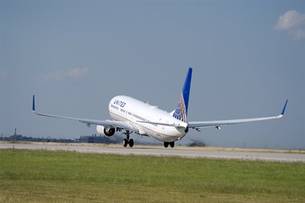
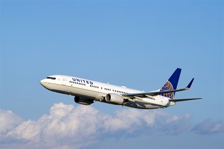
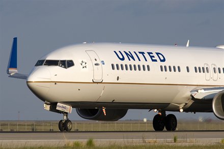
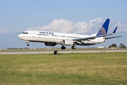
Click for a larger version
I guess the big news should be that the merger between United Airlines and Continental Airlines has gone through. yea, that is big news, the new United is now the largest airline in the world. However, this wasn’t a big shock it was going through. I am a bit more excited about these six photos of the new combined livery.
Hmm. When I saw the mock-up on the Boeing 787 I really liked it, especially with the new font. Now, I don’t know what to think seeing it on a real Boeing 737. Well my first reaction is it looks like a Continental Boeing 737 with the wrong title on it. Nothing that different or radical.
I think I will hold my final reaction with a bit more time. Right now my mind is having a hard time processing “United” on the side of a plane with Continental livery. I am sure after seeing it for a while it will start to look normal. I mean I really like the Continental livery and I like the look of this livery, I just think my brain is having a hard time computing the combination. I didn’t think I would miss the current United livery, but I think I might miss it a bit now.
What are your thoughts?
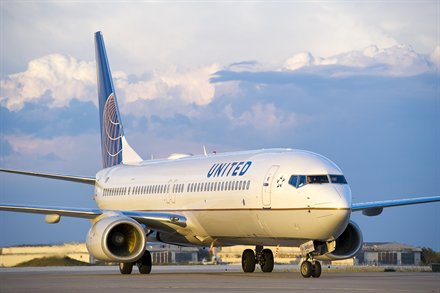
UPDATE: check out the livery in United Express set up and the new livery on a Boeing 757.
Comments are closed here.
Still looks almost photoshopped to me. I realize its a merger and not a buyout but wouldn’t it have been less costly to modify the paint of only one former set of aircraft instead of modifying every single aircraft in the fleet in some manner? (i.e. all continental aircraft get “United” on the side and all united aircraft get new tail paint jobs). Maybe they have too much paint sitting in a warehouse and need to use it up.
It just looks too boring and plain.
It’s time for marketing to come up with a new design that keeps historical design elements of both airlines.
No one wants to fly in a big beige and grey coffin. Or at least bring the U back to the tail.
“United and Continental, now combined as United Airlines is uniting even more of the world with the best service to more destinations than ever before.” “Come fly our even more Friendly sky’s”
They need to take advantage of people’s emotional connection to the product…
I am guessing it was part of the merger deal. Keep the United name, the Continental look. Goes mean the look can’t change in the future.
David
The UA tulip has too many bad memories for me. Long live CO!
I have a feeling everyone’s thinking it so go ahead and say it… This livery is stupid. Period.
If they wanted to preserve brand they should have went with continental united, united continental or a new brand. Same for the logo and liveries. Meld ’em in a meaningful way or start from scratch. Graphic designers are cheap when you consider the huge operating costs of an airline. There’s no excuse for such a half-baked approach.
This reminds me of a quote I heard earlier this week “A camel is a horse designed by committee… Worthless”
I LOVE the CO livery. I’m so happy it stayed and the UA livery went away.
I too think “United” looks weird there. I wonder if it would look better if it said “United Airlines.”
How long is it supposed to take to get the whole fleet looking like this? There are still gray and blue United planes from like the 90s.
Yea I have always been critical of the slowness of getting rid of the old gray livery. But money and then the idea of a merger got in the way. I have been told they are move forward to get the whole fleet re-painted. 60 planned by the end of the year.
David
I liked the combined look. I have always liked the Continental globe and I’m glad that won over the U Tulip.
@ Drew V – This combination is probably the cheapest way to get all the planes looking alike. All of the Continental planes have the same paint scheme, so all it takes is repainting the name. United has been in a slow transition to the new white paint scheme – only repainting planes as they were due for a paint job, which is about halfway complete right now. So the choices were: Repaint all the UAL planes, with a quick name switch for CAL; or repaint all the CAL planes plus the remaining half of the UAL fleet. Besides, I think most people like the CAL livery better.
Agreed Jim. I am hoping in the not-too-distant future there might be an entirely new livery created.
David
Now that the merger is totally done they should actually take some time to do what is right, not what will win the public’s approval.
Hey David, I found this on picture of a United Express in the new livery facebook – http://bit.ly/aK9zPT
It looks much better than I though it would. I have to admit, I think it doesn’t look too bad on the small planes.
The combination looks fine to me. Anything that will reinforce the Continental culture is a good thing.
I hate the new livery. I will sure miss the United swoosh. What an elegant design. I agree with the other comments. For all intents and purposes it’s a Continental jet with United written on the side. Good bye United. I’ll miss you.
I think this is a big mistake. The United livery with the navy blue belly and shades of blue on the sides is much more attractive and newer. I really think they should reconsider this. If they insist upon going with the globe, at leaset integrate it with the blue and white United livery. Continental’s white and gray seems awfully bland and non-descipt to me.
I just think United Ain’t United without the 4 petaled U. This paint looks like United-Continental hired someone who has never designed anything before at minimum wage to come up with a “new” scheme.
I recently travelled through Houston IAH. Scores of United jets with the new logo. I thought they were
beautiful. The design is clean, classic, and yet modern.
They have the best looking planes in the country.